Features

Every tab, every tool — what it does and why it matters.

Project Commander is an add-on for Jira, not a replacement for it. It installs into your own Jira site, reads the projects, sprints, issues, people and links you already keep there, and leaves Jira as the place the work lives. The only things it stands in for are the planning and capacity features of Jira Premium and the delivery reporting of Rovo — see the side-by-side comparison.

Looking for step-by-step guides? Read the full documentation →

Jira capacity planning & sprint capacity planning, explained →

Jira team velocity & sprint velocity, explained →

Jira velocity per person — who is actually delivering →

🛠

Dashboard

  • Open the Dashboard tab for 4 stat cards: On Pace?, Delivery Forecast, Target Date, and Progress — each answering a key project question at a glance
  • On Pace? compares completed work to work due by today and shows the verdict (Ahead of pace / On pace / Behind pace) plus the delta — color-coded green or red (this card has no amber state)
  • Delivery Forecast shows the projected date, remaining work, and capacity to target — clipped at the target date, with capacity beyond it stated on its own line (N pts capacity available after target date) — plus the deliverability verdict (the matching sprint or Beyond Sprint N (+gap) appears on the Target Date card, not here). The card explains its inputs: amber notices when the Team/Effective model resolves to zero capacity, or when efficiency is the assumed 80% rather than a measurement of finished work against committed work
  • Dashboard cards expose the relevant settings — pace measure, target date source (latest due / fixed), forecast (capacity) model, demand model, and scope growth
  • Delivery Forecast — capacity model × demand model grid — every capacity model (Each sprint's own setting, Effective team capacity, Team capacity, Velocity) against every demand model (Ignore / Respect dependencies, Resequence work, Critical Chain floor); each cell shows its finish date, gap to target, and on-target odds, shaded green / amber / red, with ★ Earliest / ▲ Latest flags and a detail panel for the selected pairing. Click a square to drive the Delivery Forecast card; the demand model is shared with the Scope and What-If tabs
  • Baselines — capture named snapshots of the plan; a timeline (forecast and target, with a period picker to focus on any date range) and a table track slip against target over time, with a per-baseline breakdown on hover; frozen snapshots saved per project and per program, rename/delete inline
  • Project Statistics table with one-line factors covering Scope, Team Capacity, Commitment vs Delivery, Estimate Accuracy, Team Balance, Dependency Conflicts, and Alerts — each row has tooltips and expand-for-detail
  • Widgets below the cards: Top Open Risks (highest-severity unresolved risks) and Velocity History (recent sprint velocity bar chart)
  • Plan Quality Warnings banner for overloaded resources, dependency conflicts, and external dates at risk — each links to the relevant tab
  • Inline AI Insights chat under the stat cards — ask natural-language questions and get answers as a grouped narrative (Project Status and Team & Plan Health) with a Recommendations list and a follow-up chat thread. Requires an API key
  • Weekly Digest one-page summary and full PDF export
Dashboard: 4 stat cards with delivery forecast, target date, progress, and Project Statistics table with every row expanded
📋

Sprints

  • The Sprints tab lets you move issues between sprints with drag-and-drop — one at a time or select multiple with checkboxes to move in bulk. While you drag, a drop strip appears under every sprint naming the next sprint (or the Backlog), so even the bottom row of a sprint has a target right beneath it
  • Toggle List View to see every issue across all sprints in a single sortable, searchable table — ideal for bulk review without opening individual sprint rows
  • Two-button mode selector per sprint: Sprint (default) and a state-aware second button — future and active sprints show Status (live progress), closed sprints show Retro (final retrospective)
  • Confidence button on every future and active sprint opens a modal with the sprint's confidence score, what is threatening it and what to cut — an active sprint judged on the work still ahead against the capacity left
  • Closed sprints report what happened: the header reads Committed · Done and the badge reads Delivered only when everything committed was finished, otherwise Delivered M of N
  • Inline editing in the issue table: click to edit Story Points, Original Estimate, Due Date, Assignee, Priority, or Summary — Enter to save, Escape to cancel. Zero-valued cells stay reliably clickable
  • Returning from a Jira link auto-refreshes sprint, project, and JQL data so edits made in Jira show up immediately
  • Quick-filter search inside any sprint card filters the issue table by key, summary, assignee, or status
  • JQL search box in the toolbar runs an ad-hoc Jira query and pulls matching issues into the view
  • Inline Create issue popover (project + type + summary) adds new issues to the backlog without leaving the tab
  • Load closed sprints on demand via the toolbar chip (Hidden / Last 5 / Last 20 / All) and run retrospectives on any past sprint
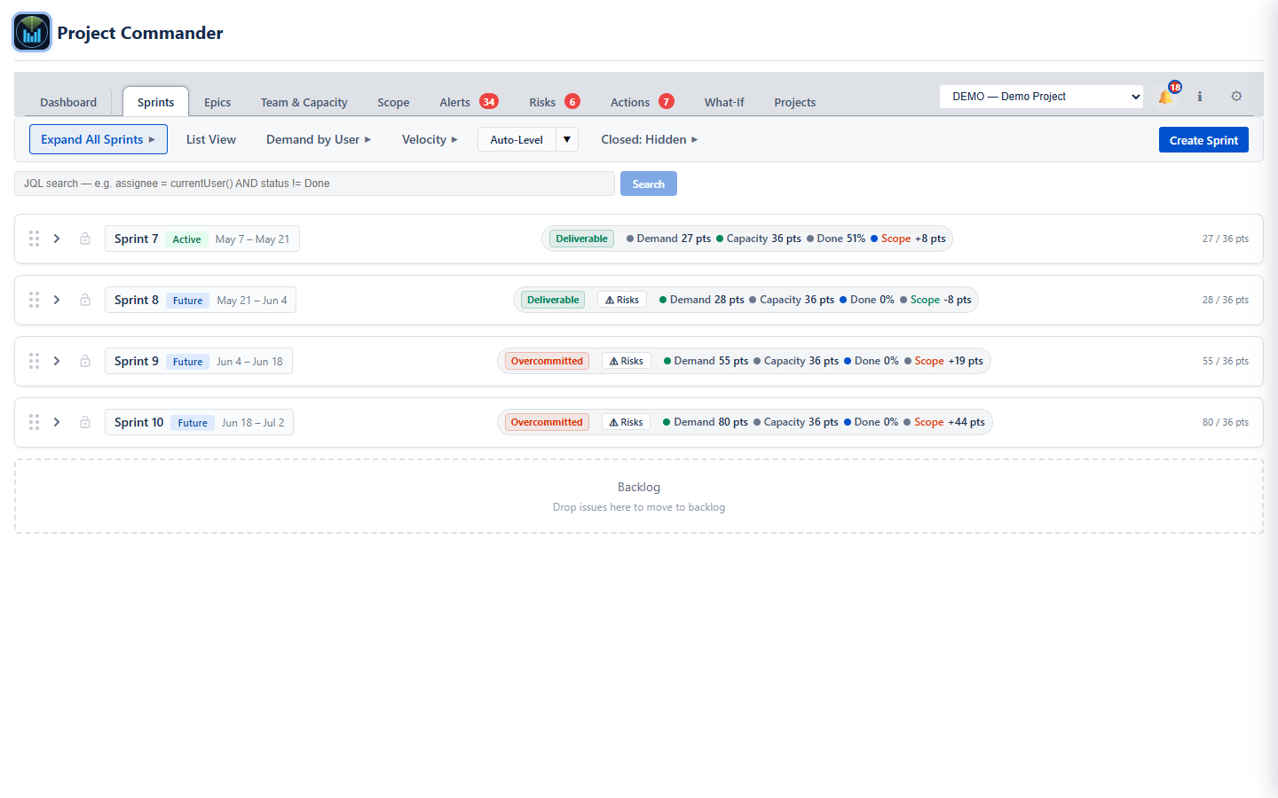
  • Every sprint shows a Deliverable, Tight, or Overcommitted badge plus demand vs capacity at a glance
  • See who's overloaded and who has room — click avatar chips in Demand by User to filter by person, expand for demand vs capacity bars
  • Auto-Level: split-button picker redistributes work across sprints using your chosen strategy (Priority, Size, Due Date, or Balanced — Balanced is the smart default that spreads load per assignee). A horizon picker limits how many sprints are rearranged (Next sprint / Next 2 / Next 3 / All); sprints beyond the horizon stay untouched. Each move shows a tooltip explaining why it happened (capacity, dependency, due date, lock, or horizon), and a summary panel above the board breaks down the deviations by reason. Compare All view, P50 / P85 forecast dates, skill-mismatch warnings, and optional one-click AI Review.
  • Velocity panel inline in the toolbar: sprint history, KPI tiles, and import controls, with effective-capacity efficiency per sprint
  • Sort by any column; drag to reorder issues within a sprint — custom order persists
  • Full sprint lifecycle: create, start, complete (with action-item and risk roll-over prompts), delete
Sprints: All sprints with deliverability badges, demand vs capacity, and Auto-Level

Auto-Level in Action

Watch Auto-Level redistribute work across sprints with one click — then undo or accept the result.

🎯

Epics

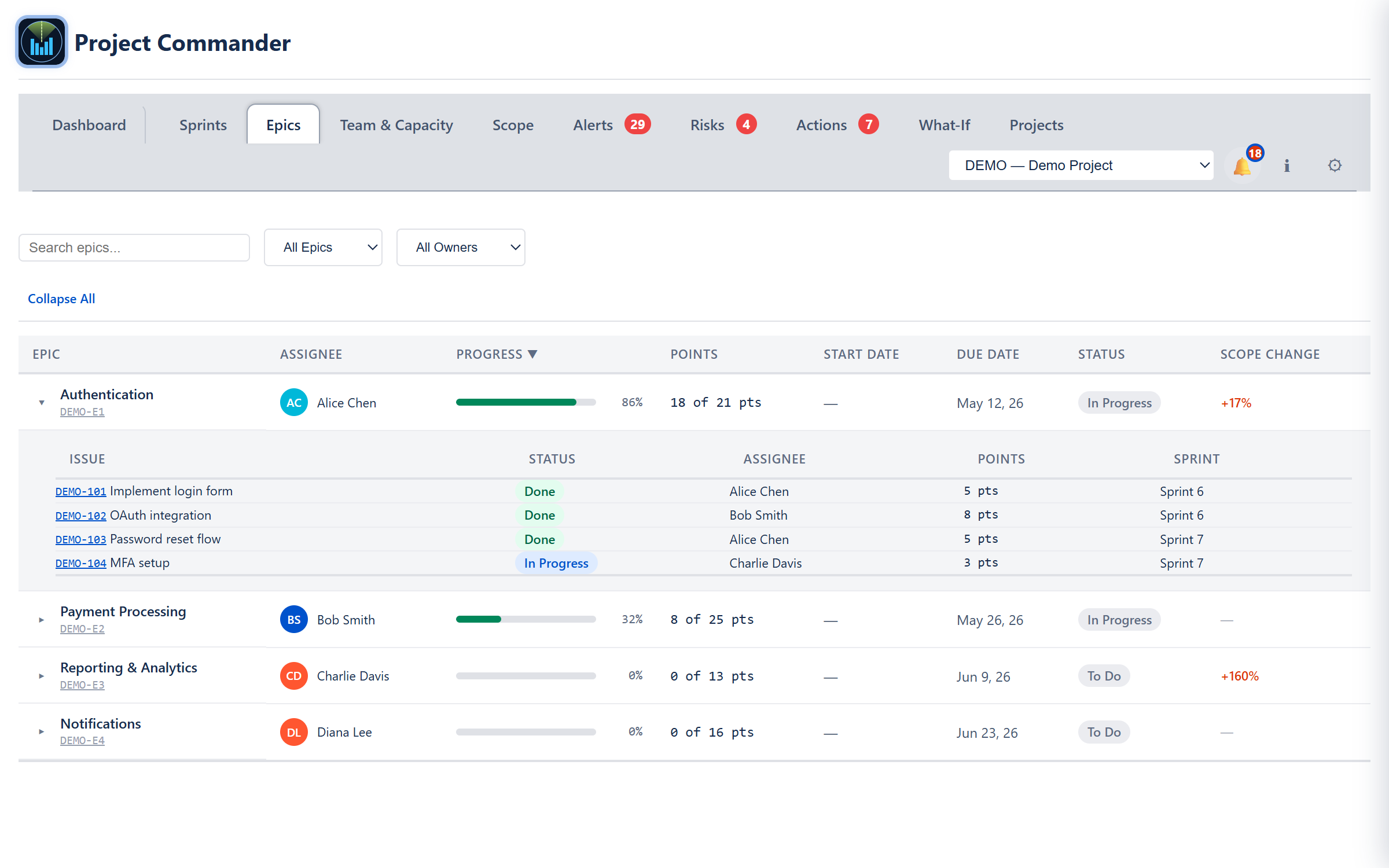
  • The Epics tab provides a single unified overview table — all epics in one sortable, searchable view
  • Progress bars, point totals, assignee, start/due dates, and Jira status fetched directly from the backend
  • Sortable columns, search, and dynamic status filter to find what you need fast
  • Status by pace — Behind, At Risk and On Track come from how much of the epic should be done by now, by the same rule as the Dashboard's On Pace card, pointed at the epic's own issues and dates; the Why column states the comparison and a sortable Pace column carries the gap, so the worst-slipping epic rises to the top. A Behind epic raises an alert.
  • Scope change tracking per epic — see what was added since the baseline
  • Expandable rows to see child issues with their details
Epics: one sortable table of every epic with assignee, progress, points, dates, status, pace, scope change, and a Why column giving the reason for each status; rows open to show the issues underneath
🎲

What-If

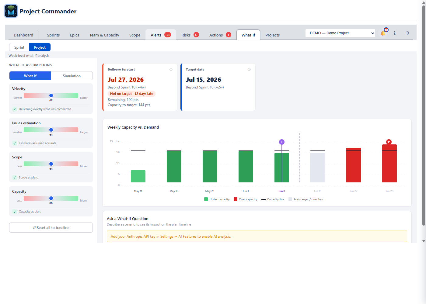
  • The What-If tab has 4 distinct sliders: Velocity, Issue Estimation, Scope, and Capacity — each directly affects your projected delivery date in real time
  • Cascade chart with an optional per-user breakdown and an optional cross-hatch overflow — turn them on to see who is over capacity and when
  • Direct connection to delivery forecast — sliders update the projected completion date instantly
  • Monte Carlo simulation with S-curve probability distribution for data-driven stakeholder forecasts — five cards on the Sprint and Project Simulation views: target week/sprint, on-target probability, Finish on Time? (Yes / Maybe / No from the run probability), expected slip, and a 0–100 Feasibility score (High / Medium / At Risk / Critical)
  • Sprint / Project / All Projects sub-views — sprint-based, weekly time-based, or the whole program rolled up
  • Program Simulation (All Projects) — the chance of the whole program finishing on time (on time only if every project is), the expected slip, a probability-over-time curve, and a weakest-links table of each project's own odds, worst first
  • Cascade overflow checkbox (on by default) carries work that does not fit a sprint into the next one; untick it to see each sprint on its own
What-If: 4 sliders and cascade chart showing capacity vs demand across sprints

What-If & Monte Carlo Video

Watch how changes to velocity, estimation, scope, and capacity affect your delivery date — then see a Monte Carlo simulation in action.

👥

Team & Capacity

  • Three collapsible sections: Team Members, Time Off, and Company Holidays
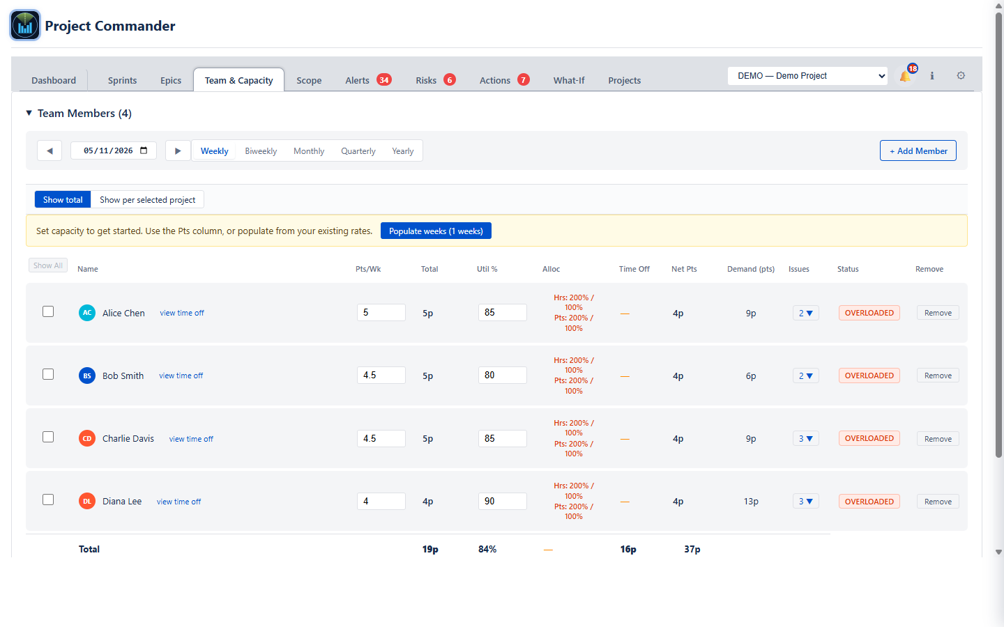
  • Per-member status badges: OPTIMAL, OVERLOADED, AVAILABLE, UNDERLOADED — see team balance at a glance
  • Add team members through an in-app + Add member dialog with their share of the selected project; a new project's team is pre-filled from its assignees, each at 100% of that project
  • Configure each member's capacity, utilization %, and time off — capacity updates everywhere automatically. Nothing typed is no capacity: the app never assumes a figure for anyone
  • Period selector (Sprint — named Period when Sprint Mode is off — Weekly, Biweekly, Monthly, Quarterly, Yearly); with Sprint chosen, a dropdown picks the sprint by name or All sprints at once, plus a Populate weeks button to bulk-fill capacity at the current rate
  • Show total / Show per selected project toggle: switch between aggregated capacity and project-scaled rows so the numbers reflect what each member has dedicated to one project
  • Alloc column on every row: each member shows Hrs: X% / 100% and Pts: Y% / 100% across the program's projects (red when over). Click the cell to open a popover with per-project percent inputs paired with an editable “= X pts/hrs” computed value — edit either, the other follows. Σ chips at the bottom of the popover sum the percents per unit and flag over-allocation independently for hours and points
  • Percent allocations survive capacity changes: bump a member's Pts/Wk or Hrs/Wk and every “= X” display in their popover recomputes from the new capacity without re-entering the allocations — a 60% allocation stays 60% across capacity changes
  • Click dates on the calendar to mark PTO; Ctrl+click toggles individual days, Shift+click selects a range. Add company holidays with optional recurring flag
  • Capacity data feeds Dashboard forecasts, What-If scenarios, and sprint planning simultaneously — one source of truth
  • The Demand vs Capacity chart now lives on the Scope tab, sitting next to the scope timeline that shares its data
Team & Capacity: per-member rows with weekly capacity, utilisation, the new Alloc column showing percent totals per unit, time-off deductions, demand, and status badges
📈

Scope

  • The Scope tab rebuilds changelog-based scope history from Jira issue changelogs — accurate, auditable tracking of exactly when and how scope grew
  • Stat cards across the top: Burned & Remaining, Scope on start, Scope now, change %, Start date (Fixed / Earliest start / Earliest due / Earliest sprint start), Target date (Fixed / Latest due / Latest sprint end), Delivery Forecast, and Capacity to target
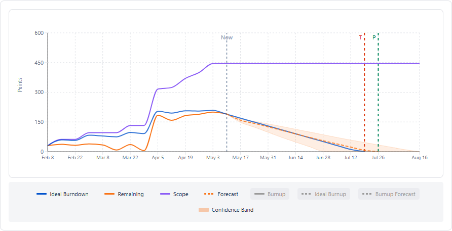
  • Burndown and burnup on the same chart: Scope, Remaining, Ideal Burndown, plus Burnup, Ideal Burnup, and Burnup Forecast. Teams that report progress as work completed read the burnup; teams that report it as work remaining read the burndown — both views agree because they come from the same data
  • Forecast strategy picker (Priority / Size / Due Date / Balanced) decides what order to burn down; the separate Capacity model picker (Each sprint's own setting / Effective team capacity / Team capacity / Velocity) decides how fast. Compare All overlays every strategy on the same chart
  • Confidence band around the forecast trace: Off, Historical variability (width comes from your team's own velocity, scope-change, and estimate-vs-actual stddevs), or Monte Carlo (P10–P85 from ~600 simulation runs)
  • Per-user filter chips, Sprint Markers toggle, Include Backlog toggle, and period grouping: All Time, Weekly, Biweekly, Monthly, Quarterly, Yearly, or Sprint (buckets by the project's actual sprint windows)
  • Scope growth rate modeling — Average over period or Manual rate — factors in how fast scope is expanding for realistic forecasts
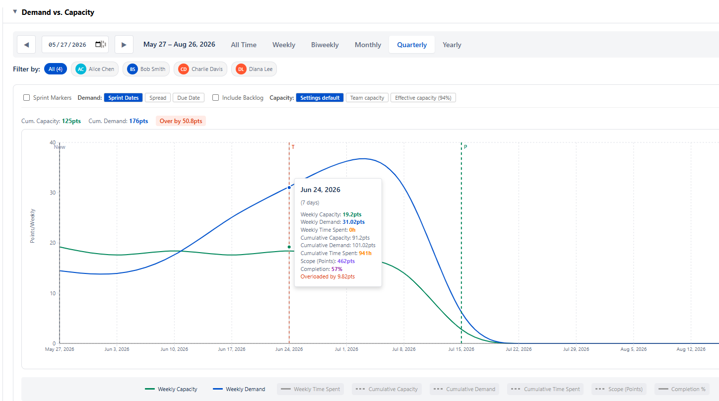
  • Demand vs. Capacity chart (collapsible) below the timeline: period capacity vs period demand over time, sharing the same target and projected-completion markers as the Scope chart
  • Weekly Breakdown table (collapsible): one row per period with Issues, Added, Burned, and cumulative Completed — expand any row to drill into the issues that contributed in that window
Scope: chart with Scope, Remaining, Ideal Burndown, Forecast plus Burnup, Ideal Burnup, and Burnup Forecast traces

Below the timeline, the collapsible Demand vs Capacity chart tests feasibility week by week — whether the team's available capacity can absorb the demand on the books. A cumulative over-by headline calls out infeasible periods; hover any week for weekly capacity, demand, scope, completion, and the exact overload.

Demand vs Capacity section on the Scope tab, open: daily capacity and daily demand across the whole project, the cumulative capacity, cumulative demand and Over by strip above the chart, and the Resource Breakdown table below it with each person's load and an OVERLOADED or OPTIMAL pill
🚨

Alerts

  • The Alerts tab finds every issue that needs attention and groups them by domain
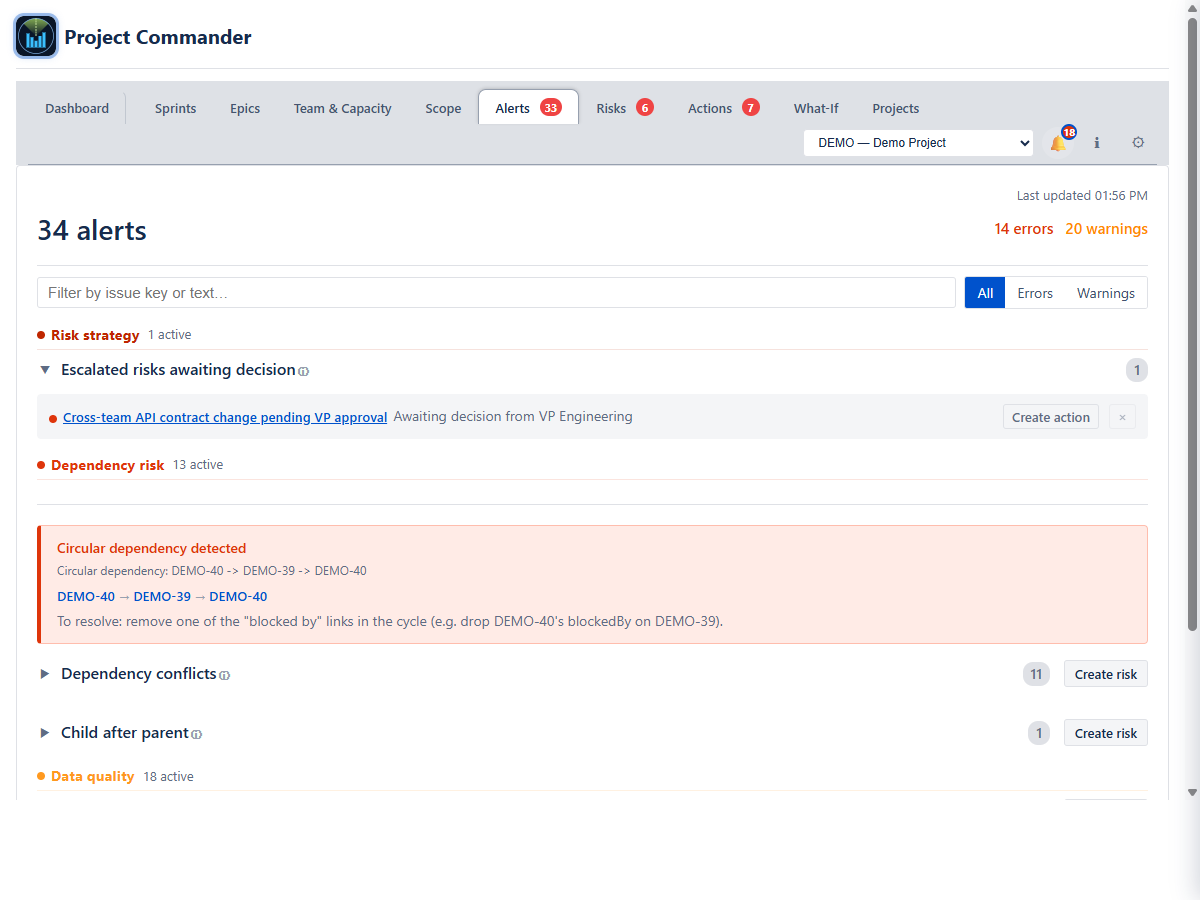
  • Five folding domain headings, each closed until clicked and reading its count: Delivery risk (overdue work, epics behind pace), Risk strategy (Escalated risks awaiting decision, Risk review due), Dependency risk (circular dependencies, blocker conflicts including an overdue-blocker check, child-after-parent), Data quality (missing dates, missing estimates, done with time remaining, unassigned) and Scope & capacity (a sprint or a person over capacity)
  • Detects circular dependencies and cross-sprint conflicts automatically — circular cycles include an inline recovery hint naming the exact edge to break first
  • Dependency conflicts include an overdue-blocker check: fires when the blocked issue's start date has passed but the blocker is still open
  • Severity filter pills (All / Errors / Warnings) plus a search box that filters by issue key or any text in the alert message
  • Per-alert dismiss (the small × on each row hides it) with a Show dismissed (N) link to bring them back — dismissals persist locally
  • a Create risk button on each Dependency-risk and Data-quality category header opens the Risks tab with a new-risk form pre-filled (probability, impact, source category); each alert row also has a Create action button
  • Badge count on the tab shows total alerts without opening the panel; click any alert to jump straight to the issue in Jira
Alerts: the five domain headings - Delivery risk, Scope and capacity, Risk strategy, Dependency risk and Data quality - each closed until clicked and reading its count, with a search box and severity buttons above

Actions & Risks

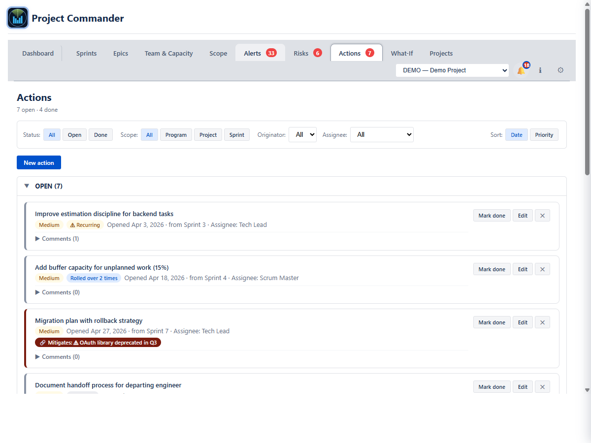
  • The Actions tab tracks follow-through items raised during sprint reviews, retrospectives, planning, or alert triage. They sit in two tables, OPEN and DONE, with a column each for the assignee, where the action came from, and its priority
  • Action fields: title, description, owner, originator (defaults to your name), priority, scope (program / project / sprint), status, optional links to related risks
  • Filter by status, scope, originator, or assignee; sort by date opened or priority. Mark done and Reopen buttons handle premature closures cleanly. Dated comments form a running log per action
  • The Complete Sprint dialog walks each open action and prompts you to mark it done, roll it over, or close it — nothing falls through the cracks
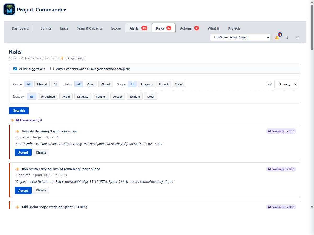
  • The Risks tab is split into AI Generated suggestions (auto-detected from your sprint data), Manually Entered risks (the ones you typed), and Accepted AI Generated risks, with closed risks folded away at the foot. Detectors raise items like velocity drops, scope creep mid-sprint, single-point-of-failure resourcing, and cross-sprint dependency conflicts
  • Each risk has Probability (1–5) × Impact (1–5) with derived Severity, RACI owners (Accountable, Responsible, Consulted, Informed), Originator, and status (Open or Closed) — separate from the response strategy (Mitigate / Accept / Transfer / Escalate / Defer / Avoid)
  • Response strategy on every risk — pick from Avoid, Mitigate, Transfer, Accept, Escalate, Defer (or leave Undecided). Strategy-specific required fields (escalation owner, review-by date, rationale) plus a full audit trail of strategy changes
  • One-click accept — accepting an AI suggestion creates the risk instantly, with the detector-specific mitigation actions attached automatically and a full audit trail. The new risk lands in Manually Entered with the normal edit, close, action and comment controls
  • Filters: Source (All / Manual / AI), Status, Strategy (All / Undecided / Avoid / Mitigate / Transfer / Accept / Escalate / Defer), Scope (All / Program / Project / Sprint). On-tab toggles: AI risk suggestions and Auto-close risks when all mitigation actions complete
  • The Dashboard's Top Open Risks widget adds a strategy mix bar (e.g. "4 mitigate · 2 accept · 1 escalate · 3 undecided") and sorts Undecided and Escalate risks above Accept at the same severity, so attention-demanding items surface first
  • The Complete Sprint dialog lists every risk whose linked actions are all complete and offers one-click Mark Closed — the register stays current without manual cleanup
  • Badge counts on both tabs show open items at a glance
Actions tab: the OPEN and DONE tables, each row carrying the action, its assignee, where it came from and its priority, with Mark done, Edit and delete on the row Risks tab: AI-generated and manual risk register with probability, impact, severity, and RACI owners
📅

Timeline Coming soon

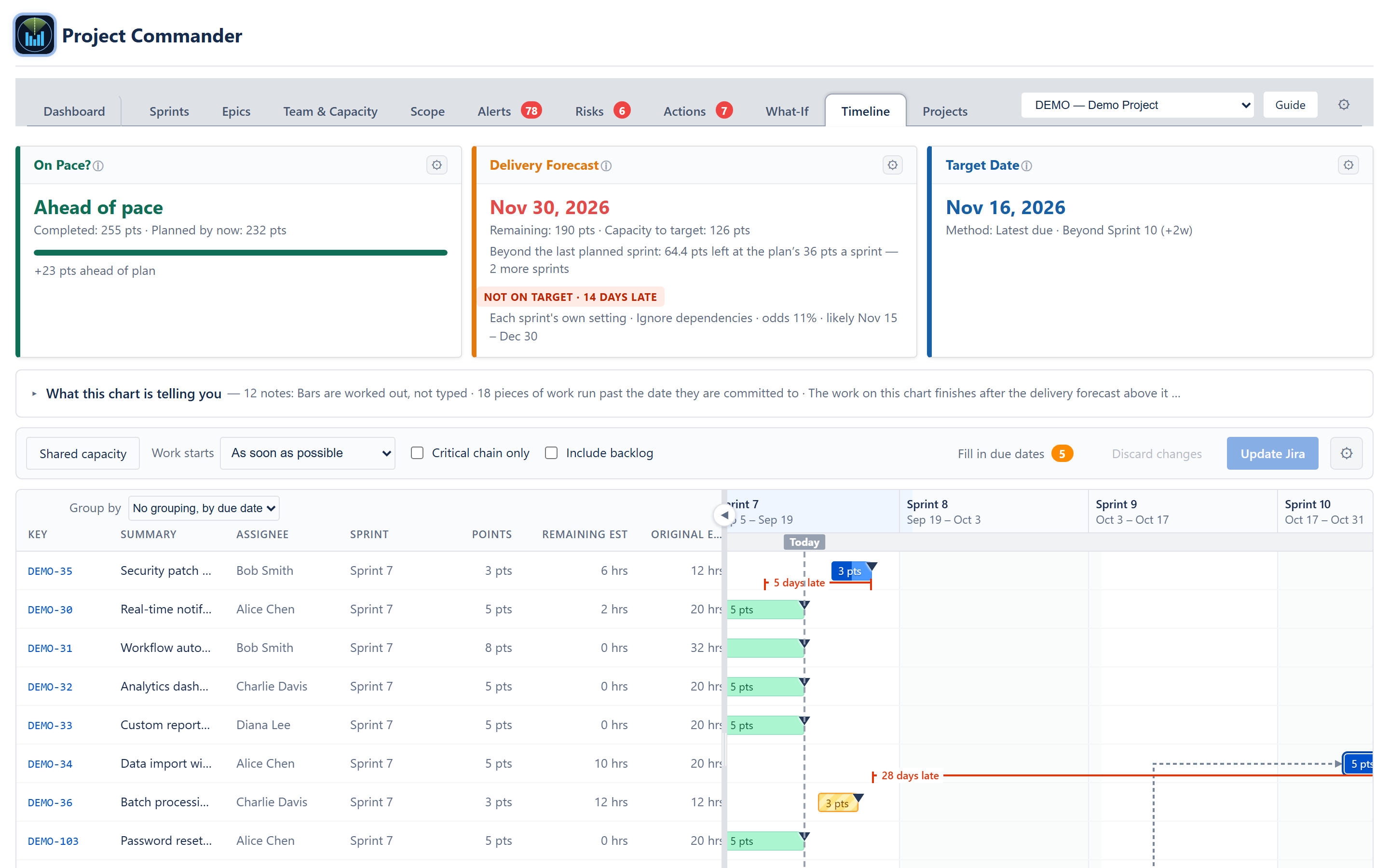
  • Every epic and issue as a bar on a calendar — the done share filled in, finished work in green, and work placed by a date somebody typed drawn striped, so a typed date is never mistaken for a worked-out one
  • Columns are your sprints, named and dated, with projected sprints past the last planned one marked as projected. A project with Sprint Mode turned off gets its own planning periods instead. Scale by sprint, week or month, with a zoom slider along the bottom of the chart
  • Today, the target date and the forecast date are marked on the chart, the likely-finish range shaded behind them and the stretch past the target hatched — the same dates as the Delivery Forecast, Target Date and On Pace cards sitting above the chart, because they come from the same calculation
  • Twelve sortable columns down the left — Key, Summary, Assignee, Sprint, Points, Remaining Est, Original Est, Status, Type, Start Date, Due Date and Progress — with a draggable divider between the table and the chart, and both panes scrolling together
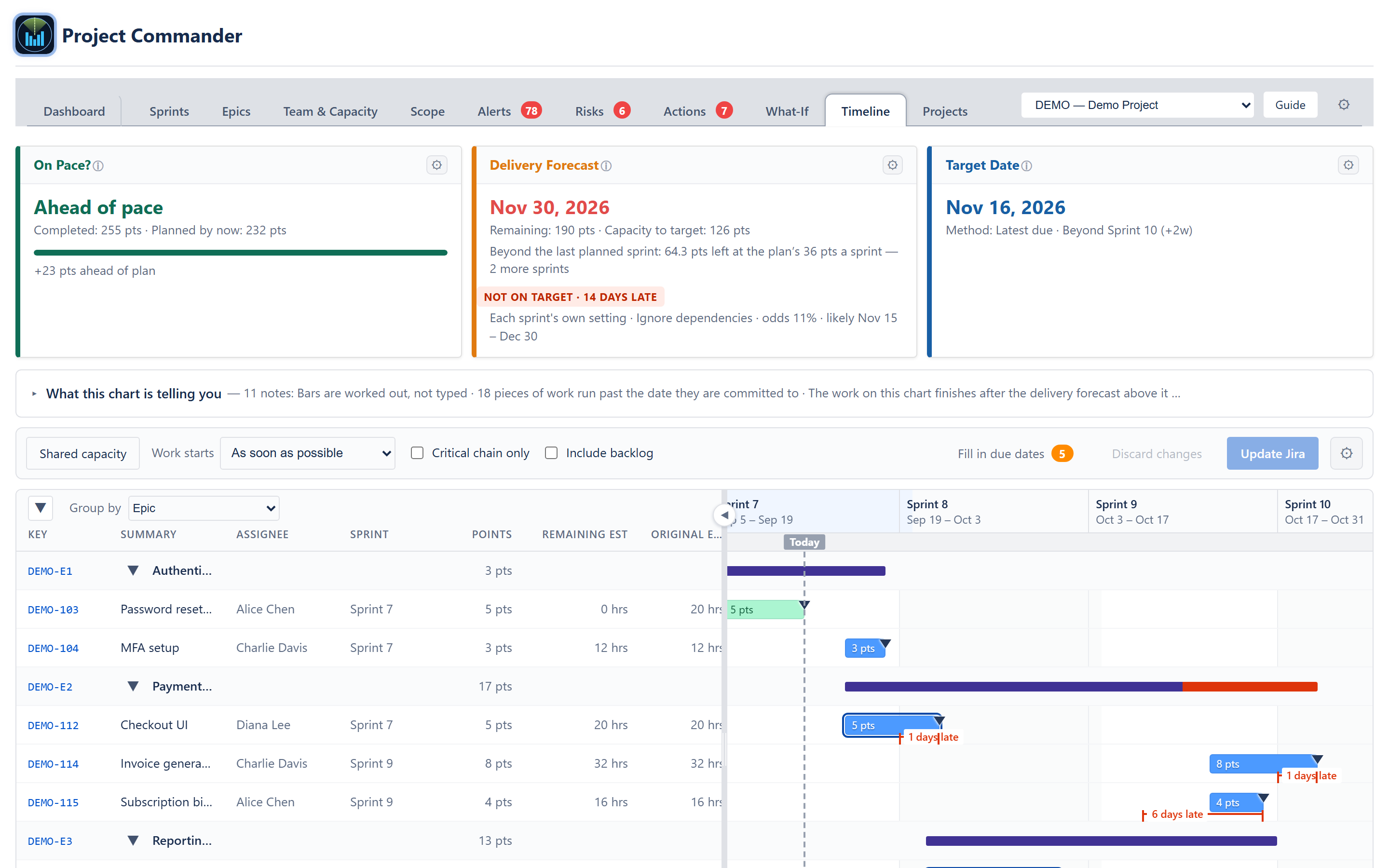
  • Group by Epic, Person, Project, Sprint, or nothing at all, with one arrow that folds every band or opens them all again. Ungrouped, the list runs earliest due date first, an issue with no due date of its own using its epic’s
  • Dependency arrows from Jira’s own “blocks” links. An arrow that points backwards — work waiting on work scheduled later — is drawn dashed, so the conflict is visible on the picture and not only in a list
  • The critical chain laid over the same chart. Tick one box and everything not on the longest run through the plan fades away. The tab says which of the two things the chain is: a run of dependent work, or the busiest person’s own queue
  • The date each piece of work is committed to is a marker on its own row, and where the bar runs past it the days late are measured and labelled on the row
  • A person over capacity in the stretch a bar falls in gets a red ring around the bar, so overload shows up on the chart itself
  • Shared capacity, in one press. Every registered project on one chart, one lane per person, one queue each. Somebody booked solid across two projects stops looking comfortable on both — the portfolio views in the other tools stack one chart per project and cannot see it
  • Hover any bar for why it starts when it does — waiting on a blocker, waiting for the person who has it, its epic’s start date, timed to finish on its due date, or a date somebody typed — along with its owner, epic, sprint, size, forecast dates and what it blocks
  • Edit on the chart. Drag a bar sideways to set its start and due dates, drag either end to change the size of the work, drag it into another person’s lane to reassign it, or change Assignee, Points, Status, Start Date and Due Date in the table. Nothing reaches Jira until you press Update Jira and confirm the list of changes, issue by issue and field by field
  • “What this chart is telling you” — a folding notice above the chart that says in plain words what the picture is showing: which start rule is in force, who is over capacity and why, which dependencies point backwards, which dates were typed rather than worked out, and what the critical chain adds up to
Timeline tab: the folding notice open, work listed earliest due date first, dependency arrows between the bars, a six-days-late measurement, the allowance tail to the forecast pin, the Scale and zoom strip and the key along the bottom

Grouped by epic, each epic gets its own span across the top of its issues, drawn red where it runs past its due date. The three cards above the chart — On Pace?, Delivery Forecast and Target Date — are the app’s own, so the dates on the chart and the dates on the cards can never disagree. The Timeline tab is built and in testing; it is not in the released app yet.

Timeline tab grouped by epic: sprint columns with Today marked, epic spans, issue bars carrying their point sizes, committed-date markers, a days-late measurement, and a twelve-column table down the left
🏙

Projects

  • The Projects tab shows every project's Health (Healthy / At Risk / Critical), Progress %, Forecast date, Target date, Slack days, Scope, Utilization, Team size, Alert counts, and Estimation coverage in a single table — everything visible without drilling in
  • An Active checkbox on every row (plus Select all / Deselect all) chooses which projects the app looks at — untick a project and it disappears from every view, picker, forecast, and rollup and its board is no longer fetched, while its settings, allocations, and dependencies are kept for the moment you re-tick it
  • A Program totals row at the bottom rolls weighted averages across every active project
  • Switch the header selector to Program view and every tab — Dashboard, Scope, Alerts, Risks, Actions, Epics, Team & Capacity, What-If — unions data across every active project you manage
  • The portfolio table is a read-only overview — Target, Scope, and Team are display-only (a project's settings change on its Edit form). Model program-level what-if changes (capacity, scope, velocity) in the What-If tab's All Projects view, which never writes back to Jira
  • + Add Project requires Project Key and a JQL Filter, plus a Board ID while Sprint Mode is ticked (untick it and the board is not needed: the work comes from the filter and the team is filed under the project key); Edit and Delete buttons sit on every row, with confirmation before delete
  • Team Allocation Matrix (collapsible): a grid of every team member × every project. Each cell shows the percent of capacity dedicated to the project plus a computed “= X pts/hrs” line, read-only here. Hours and points percents are independent. Status column shows Σ per-unit totals against 100% and flags over-allocation per unit independently. Allocations are edited in the Team & Capacity tab's Alloc popover (where editing either the percent or the “= X” value updates the other, and setting a cell to zero while the member still has unfinished work prompts for confirmation)
  • Critical Chain (collapsible) calculates the resource-constrained sequence that drives the earliest possible finish date — dependencies plus the fact that the same person cannot be in two places at once
  • Cross-Project Dependencies (collapsible) lets you declare that one project blocks another. Upstream slips past a downstream target date trigger a violation flag
Projects tab: multi-project table with health, forecast, slack, utilization, and alerts per project

The Critical Chain panel shows the resource-constrained sequence that sets the earliest possible finish date — dependencies plus the fact that the same person can’t be in two places at once. The chain (solid blue) is the longest weighted path through the combined graph of dependency edges and resource-queue edges; feeder paths (orange) merge into it; idle-resource gaps (dotted) show where the schedule is paused on availability rather than blockers. The assignee owning the most chain work is the bottleneck.

Ready to Take Command?

Get it on the Atlassian Marketplace See it Live →

Free during beta — no credit card, no commitment. Questions? support@projectcommander.app