Catch delivery failure before schedules break.

Plan · Monitor · Forecast

Built for the delivery lead who's tired of saying "we'll see" when stakeholders want a real date.

Dashboard Gadget
Jira App
Standalone Web App

Jira Cloud · Scrum or hybrid · Story points or time estimates

Tracks demand vs. capacity over time — so you see overload coming before it arrives.

📊
Will we deliver on time?
🚨
Who's overloaded?
📈
Where's scope creeping?
🎲
What needs fixing now?
Try It Free — Demo or Connect Your Jira →

Most tools tell you what's happening. Project Commander helps you plan the work, monitor for problems as they emerge, and forecast delivery with confidence — for one project or for every project your team runs.

2-Minute Overview

Dashboard, Sprints, What-If, Team & Capacity, Scope, Alerts, and more.

Without Project Commander
  • Find out you're late on the day the sprint ends
  • Scope creeps in and nobody notices
  • "Will we make it?" — "I think so"
With Project Commander
  • See the slip coming three sprints early
  • Know exactly where and when scope grew
  • "Will we make it?" — "85% chance by March 15"

Built for project managers, scrum masters, and engineering leads who need to answer hard questions about delivery — not just track tickets.

Why it works

Three reasons the forecast holds up where spreadsheets and gut-feel don't.

Uses your Jira data

Sprints, capacity, dependencies, history, time off, holidays. No second tool, no manual sync.

Real probability, not a guess

Monte Carlo simulation runs the forecast hundreds of times. P10–P85 finish-date envelope, not a single optimistic line.

Auditable math, optional AI

The numbers come from deterministic algorithms you can audit. AI is presentation only — never in the math path.

Phase 1 — Plan

Sprint 7 is overcommitted.
Sprint 8 is even worse.

Open the Sprints tab and every sprint shows a Deliverable or Overcommitted badge at a glance — with demand, capacity, and scope change on the same line. When one sprint is overloaded and another has room, hit Auto-Level and the work redistributes automatically, respecting priorities, dependencies, and per-sprint limits. Don't like the result? Undo with one click.

Stop manually dragging issues between sprints for an hour every Monday.

Sprints tab: Sprint 5 Deliverable, Sprint 6 Deliverable, Sprint 7 Overcommitted, Sprint 8 Overcommitted — each with demand, capacity, and scope pts

Someone is underwater.
How much can your team take on?

The Team & Capacity tab shows every team member's demand vs capacity at a glance — who's overloaded, who has room, and by how much. Set weekly hours, mark time off, add holidays, and capacity updates everywhere automatically. Status badges (Optimal, Overloaded, Available) make imbalances obvious.

Running people across multiple projects? Each row's Alloc cell shows percent totals per unit (Hrs: X% / 100%, Pts: Y% / 100%) and opens a popover where you edit each project's allocation as a percent of capacity, with an editable “= X pts/hrs” computed value next to it. Bump someone's Pts/Wk and every “= X” updates live — a 60% allocation stays 60% across capacity changes.

Stop burning out your best people. Capacity planning that accounts for real life.

Team & Capacity tab: per-member rows with weekly capacity, utilisation, the Alloc column showing percent totals per unit, time-off deductions, and status badges
Phase 2 — Monitor

Scope keeps growing.
Nobody sees it happening.

The Scope tab rebuilds scope history from Jira changelogs and renders burndown and burnup on the same chart: Ideal Burndown, Remaining, Scope, Forecast, plus Burnup, Ideal Burnup, and Burnup Forecast. Read progress as work remaining or work completed — whichever framing your team uses. Filter by team member, switch between Weekly, Monthly, Quarterly, or Sprint-bucketed views. The "Now" marker separates history from forecast so you can see exactly when scope started running ahead of plan.

Scope creep is the silent project killer. Now it's visible.

Scope tab: Ideal Burndown, Remaining, Scope, and Forecast lines on a weekly chart with team member filter and Now marker

Running multiple projects?
See them all in one place.

Open the Projects tab to see every project's health, forecast, slack, utilization, and alerts in a single table. Switch the header selector to Program view and every tab — Dashboard, Scope, Alerts, Risks, Actions, Epics, Team & Capacity, What-If — rolls up across every project you manage. Register cross-project dependencies and run draft what-if scenarios you can save and compare.

The Team Allocation Matrix below the projects table splits each member across the program's projects: each cell shows the percent of that member's capacity dedicated to the project, paired with an editable “= X pts/hrs” computed value — edit either, the other follows. Σ percent totals per row flag over-allocation independently for hours and points. Capacity changes (Pts/Wk, Hrs/Wk) update every “= X” display live without re-entering allocations.

A critical chain diagram shows the resource-constrained path to delivery across all projects — which issue is blocking everything else, and who is the bottleneck.

Projects tab portfolio table: one row per project with health, progress, forecast, target, slack, scope, utilization, team, alerts, and estimation columns, and a Program rollup row at the bottom
Phase 3 — Forecast

You committed to a date.
Is it still realistic?

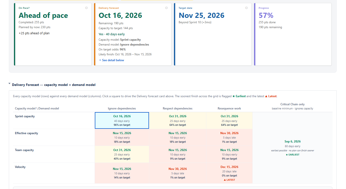
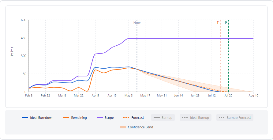
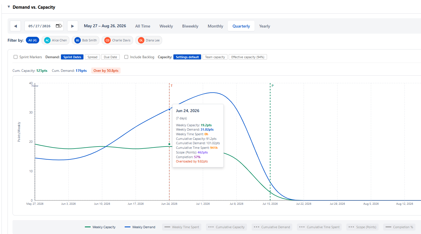
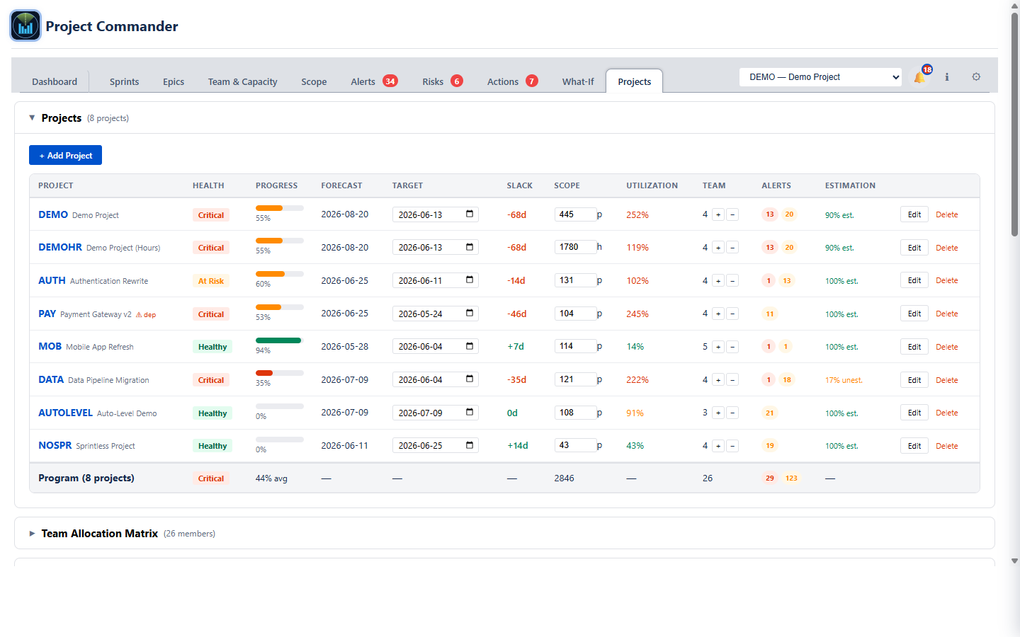
Four stat cards — On Pace?, Delivery Forecast, Target Date, Progress — answer that instantly. Each card has a gear icon for per-card settings: switch forecast methods, change date sources, toggle scope growth. Below, a diagnostics table scores 14 project health factors from green to red. Click any row to see the detail.

No digging through boards, no guessing. Open the dashboard, get the answer and a plan.

Dashboard showing 4 stat cards — On Pace?, Delivery Forecast, Target Date, Progress — and the Diagnostics table

See the impact before
you make the call.

The What-If tab lets you move sliders for velocity, scope, capacity, and estimation accuracy and see your delivery date shift in real time. Push scope up 20% — the cascade chart shows exactly which sprints absorb the overflow. Switch to Simulation mode and run a Monte Carlo analysis: instead of a single date, you get a probability curve. "We'll finish by June 28" becomes "85% chance we finish by June 28" — a number worth putting in a status update.

What-If tab: velocity and scope sliders, cascade chart, Monte Carlo probability forecast

What if we add someone
to that project?

In the Projects tab, every project row has a + and − next to the team count. Click + and the row updates instantly — new forecast date, new utilization, new slack — with a plain-English explanation below it: "Added one team member. Utilization moves from 251% to 201%. Slack improves by 17 days." Don't like it? Hit Revert. Stack multiple changes across projects to model a reorg, a hiring decision, or a deadline shift — all without touching Jira.

The answer to "what if we add someone to that project?" used to be a spreadsheet and a meeting. Now it's one click.

Projects tab: clicking + on a project row shows before/after forecast, utilization, and slack with a plain-English explanation

See It in Action

Try It Free — Demo or Connect Your Jira →

Interactive demo with sample data, or connect your real Jira — no install required.

Auto-Level

Redistribute work across sprints with one click — pick a horizon, see exactly why each move happened, then undo or accept.

What-If & Monte Carlo

Adjust variables and run simulations to forecast delivery probability.

A Complete Toolkit — Plan, Monitor, Forecast

Everything a project manager, scrum master, or engineering lead needs — in one app.

Plan
📋

Planning

Drag-and-drop issues between sprints, multi-select to move in bulk, and inline-edit Story Points, Original Estimate, Due Date, Assignee, Priority, or Summary right in the table. Toggle List View for a flat searchable view, or quick-filter inside any sprint. Per-sprint state-aware modes (Status while active, Retro once closed) plus a Risks button that surfaces AI-detected risk factors.

🔗

Dependency Tracking

Cross-sprint blocker detection, dependency map, and violation highlighting. Know which blockers will cascade before they do.

🏙

Program Management

Run multiple related projects as one program from the Projects tab. Cross-project dependencies, team allocation matrix with percent-of-capacity inputs (independent percents per unit, with a computed “= X pts/hrs” readout that updates live when capacity changes), and inline what-if mutations (add headcount, move scope, shift dates) with per-step × Revert and plain-language explanations. Switch the header to "Program view" and every tab unions data across projects. Critical Chain shows the resource-constrained delivery path across the program.

Monitor
🚨

Alerts

Issues that need attention grouped by domain (Risk strategy, Dependency risk, Data quality). Circular cycles include an inline recovery hint naming the edge to break; the overdue-blocker check flags blockers still open after the work they're blocking should have started. Severity pills, search, per-alert dismiss, and a one-click Create risk shortcut to promote any alert into the risk register.

Risks & Actions

Live risk register split into AI Generated suggestions and Manually Entered risks. Probability × Impact with derived severity, RACI owners (A/R/C/I), and a response strategy chip on every risk (Avoid, Mitigate, Transfer, Accept, Escalate, Defer) with strategy-specific required fields and a full audit trail. Sprint-End Closure retires risks whose mitigation actions are all done. Actions render as cards with severity stripes, scope levels (program / project / sprint), originator, priority, and dated comments.

🎯

Epic Tracking

Single overview table with progress bars, point totals, assignee, dates, and Jira status. Sortable columns, search, and dynamic status filter. Expand any epic to see child issues.

Forecast
📅

Delivery Forecast

Per-user simulation engine with multiple forecast methods (sprint capacity, team capacity, effective capacity, velocity). Capacity editor lets you fine-tune sprint-by-sprint. Stacked bars show per-member load. Auto-Level surfaces P50/P85 finish dates from a Monte Carlo run on the resulting plan.

🔎

Impact Analysis

Add or remove a team member on any project and see the forecast date, utilization, and slack update instantly — with a plain-English explanation of the change and a Revert button. Stack multiple mutations to model a reorg or deadline shift before committing. In the What-If tab, sliders for velocity, scope, capacity, and estimation feed a Monte Carlo simulation that turns gut feel into a probability curve.

See All Features with Screenshots

Plan Better. Ship on Time.

Connect your Jira and start planning, monitoring, and forecasting in minutes — Auto-Level fixes overloaded sprints in one click, the Dashboard tells you if your deadline is still realistic, and What-If scenarios let you model any change before you make it. Works with sprints or kanban, points or time estimates. Starts read-only for safety.

Try It Free — Demo or Connect Your Jira →

Free during beta — no credit card, no commitment. Your credentials stay in your browser. Questions? support@projectcommander.app