Jira Team Velocity
Project Commander is an add-on for Jira, not a replacement for it. It installs into your own Jira site, reads the projects, sprints, issues, people and links you already keep there, and leaves Jira as the place the work lives. The only things it stands in for are the planning and capacity features of Jira Premium and the delivery reporting of Rovo — see the side-by-side comparison.
New — the Timeline tab. A Gantt chart nobody has to maintain: every epic and issue drawn as a bar where the forecast puts it, from the size of the work, who has it, the hours they really have, their booked time off and what blocks what. Sprints across the top, dependency arrows between the bars, the critical chain on one tick, and the same target and forecast dates as every other screen. See what it does →
This page is a working guide to team velocity in Jira: how to open Jira's velocity chart, what its two bars actually mean, the five things it will not tell you, and how to turn velocity into a delivery date you can defend. Every statement about Jira here comes from Atlassian's own documentation.
What velocity is, and what it is not
Velocity is output. It is how much work a team finished per sprint, measured in whatever they estimate in — story points, hours, days, or a count of items. It is a record of what happened.
Capacity is availability. It is how much time the team actually has next sprint, given who is present, who is on holiday, and who is shared with another project.
Treating the first as the second is the single most common way a plan goes wrong. "We do about 30 points a sprint, and 120 points are left, so that is four sprints" reads as arithmetic, but it assumes the next four sprints look like the last few — same people, same availability, nobody away. If two of the five are on leave next sprint, 30 was never the right number to plan with, and no amount of velocity history will say so.
Velocity earns its place as evidence of pace. It answers "how fast has this team gone when it was whole?" It cannot answer "what can this team do next month?"
How to open Jira's velocity chart
Jira has a velocity chart built in. It is available on company-managed Scrum projects only — team-managed projects and Kanban boards do not have it.
- Open your company-managed Scrum project.
- Select Reports in the sidebar.
- Choose Velocity Chart.
The chart appears with one pair of bars per completed sprint, most recent on the right.
How to read the two bars
Each sprint gets two bars and there is a line across the whole chart.
- The grey bar is the total estimate of everything in the sprint at the moment the sprint started — what the team committed to.
- The green bar is what was actually completed by the time the sprint ended.
- The black line is the average completed across the sprints shown.
The gap between grey and green is the more useful number, and most teams look straight past it. A team whose green bar is consistently 70% of its grey bar is telling you something precise: whatever this team commits to, about seven tenths of it gets done. Plan the next sprint at 100% of the commitment and you will be wrong by the same 30% you have been wrong by every sprint so far.
The y-axis follows your board's estimation setting — story points, a time unit, item count, or a numeric custom field.
Five things the velocity chart will not tell you
1. Who produced the work
The chart is one number for a whole team. A velocity of 30 can be five people delivering six each, or two people delivering thirteen each while a third is blocked every sprint. Those are completely different risks and the chart shows them identically. Lose the wrong person from the second team and the 30 was never real.
2. Whether it is going up or down in any useful way
The chart draws an average line across the sprints shown. An average treats a team that went 28, 30, 31 exactly the same as one that went 48, 30, 12 — both average 30. The first can be planned months out. The second needs a range, and its last three sprints are a warning nobody has read.
3. Anything from subtasks
Atlassian states that estimates on subtasks are excluded, and only parent-level estimates are counted. If your team does its estimating at subtask level, the chart is measuring something other than the work you did.
4. Anything outside this one board
The chart is board-specific and only includes work matching that board's saved filter, using that board's column mapping to decide what counts as done. Work the team delivered that sits outside the filter did not happen, as far as the chart is concerned. For a team working across several boards, no single chart shows their real output.
5. Whether you will hit your date
This is the gap that matters most. The chart is a record of the past. It does not know what work is left, it does not know who is available for the sprints ahead, it does not know that two of your issues block each other, and it never produces a finish date. Turning velocity into a date is a calculation you are left to do in a spreadsheet, using an average that has just been shown to hide the things that would change the answer.
A worked example: the team doing 30 a sprint
A five-person team. The velocity chart shows the last six sprints averaging 30 points completed. There are 120 points of work left, so the plan says four sprints, and a date is promised on that basis.
What the chart did not show:
- The grey bars average 42 while the green average 30. This team commits to 42 and finishes 30 — about 71% — every sprint. Nothing in the plan accounts for that.
- Two of the five produce roughly two thirds of the points. One of them is leaving in a month.
- The last three sprints read 38, 30, 22. The average is still 30. The direction is down.
- Two people are on holiday during what would be sprint three of the four.
Four sprints was never the answer. And every fact needed to know that was somewhere in Jira — just not on the chart being used to make the decision.
Closing each gap with Project Commander
Project Commander is a Jira app that reads your velocity history and everything the chart leaves out, and turns them into a date. It works on every Jira Cloud edition, including Free and Standard, and on boards of any type.
Velocity with its trend and its spread
Velocity is charted sprint by sprint with the trend and a rolling average, so a decline is visible as a decline rather than being flattened into one number.

Who is actually delivering it
The sprint history can be filtered to one person. That is the gap Jira's chart cannot show at all, and it is answered in full on its own page: Jira velocity per person.
Committed against delivered, used as a planning number
The gap between what a team commits to and what it finishes is measured from your own sprints and applied to the plan, so a team that reliably finishes 80% of its commitment is planned at 80% rather than at 100%.
Velocity as evidence of pace, capacity as the limit
The two are kept apart and both are used. Velocity says how fast this team has gone; each person's real capacity — their own hours, with holidays and leave already subtracted — says what is possible in the sprints ahead. The capacity half has its own guide: Jira capacity planning.
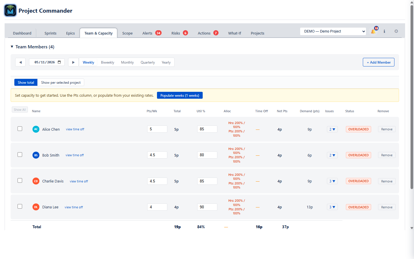
It becomes a date
Velocity, capacity, the work remaining and the dependencies between issues produce a projected finish date, compared against the date you have committed to. When the trend turns down, it shows up as the date moving rather than as a shorter bar you have to interpret.
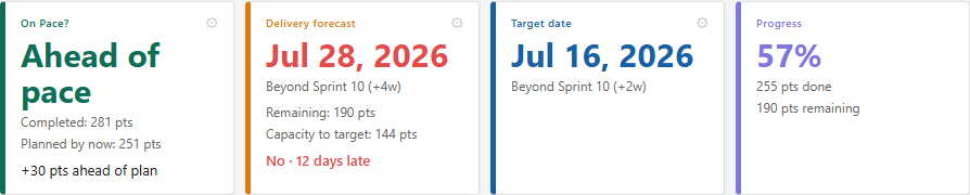
And you can test what would fix it
Before promising a date, you can try the change — another person, less scope, a later target — and see what it does to the finish date.
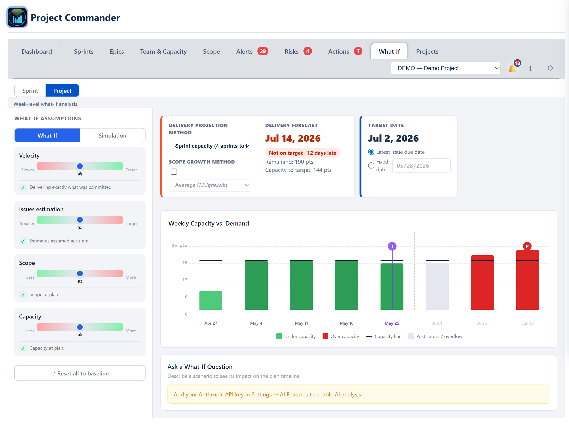
Common questions
Where is the velocity chart in Jira?
In a company-managed Scrum project, under Reports in the sidebar. Team-managed projects and Kanban boards do not have it.
What do the grey and green bars mean?
Grey is everything in the sprint when it started — the commitment. Green is what was finished by the end. The gap between them is how much of what your team promises actually lands.
Can I see velocity per person in Jira?
No. The chart is one figure for the whole team, on every edition. What to look at instead is covered in full on Jira velocity per person.
Why can I not just divide the remaining work by velocity?
Because velocity is what happened when the team was whole, and the sprints ahead are not that. It cannot see holidays, someone leaving, a person shared with another project, or two pieces of work that block each other — and any one of those changes the answer.
Is velocity the same as capacity?
No. Velocity is what a team produced. Capacity is what it has available. Planning with the first in place of the second is the most common reason a sprint plan that looked realistic slips.
See your real velocity picture
Velocity is one part of it. On the main site you'll find everything Project Commander does — the capacity check, the delivery forecast, threatened dependencies, and every project's health in one place — along with the interactive demo and the free install.
Related reading: Jira velocity per person · How to read team velocity without fooling yourself · Sprint capacity planning in Jira · All Project Commander features