 Project Commander Docs
← Back to site
Project Commander Docs
← Back to site
Getting Started — Feature Guide
What this guide is for
Project Commander is an add-on for Jira, not a replacement for it. It installs into your own Jira site, reads the projects, sprints, issues, people, time tracking and dependency links you already keep there, and leaves Jira as the place the work lives. Nothing is copied out and no second system of record is created. The only Atlassian products it stands in for are Jira Premium — its planning and capacity features — and Rovo, whose delivery reporting it replaces with arithmetic.
This is the five-minute path from opening Project Commander for the first time to a screen that answers the question the whole app is built around: can this work realistically be delivered in the time and capacity we have, and if not, where is the risk?
You'll set the app up, point it at your work, tell it about your team, pick how it should forecast the finish date, and then read the three screens that show whether you're on track. Every step says exactly where the control lives so you can follow along in the app.
This guide describes Project Commander installed in your Jira site from the Atlassian Marketplace. The web app at projectcommander.app/app offers two ways in without installing anything: See Demo (the same screens on sample data — nothing stored, resets on reload) and Connect Your Own Jira (your real project, read-only — one-click authorization through your Atlassian account, no token to paste; your notes and settings stay in that browser). The installed app is the full product — team-shared data, velocity history, trends, and write-back — so to follow this guide end to end, install it from the Marketplace.
1. First launch — the setup screen
The very first time the app opens, a one-page setup screen, headed Set up your first project, asks the four things it needs: Project Key, Board, Issue filter, and How is work estimated? — Story Points or Time (choosing Time reveals an Hours / Days picker). Type your project key — the prefix on every issue, like AUTH — and leave the field: the app checks it against your Jira site, fills in the project's real name and the standard "everything in this project" filter, and finds the project's board for you (if the project has several boards you pick one from a short named list; if it has none you type the board number from the board's URL). A key Jira doesn't recognize is flagged as soon as you leave the field, next to it. Click Add Project: if the Project Key, the Board or the Issue filter is empty, a line under that field says what to enter, and nothing you typed is lost; otherwise the app checks with Jira that the board exists and that Jira accepts the filter, says in words beneath the questions if either fails, and otherwise lands you on the Dashboard with your project's numbers.
Beneath the estimation choice, one optional question asks How did you hear about Project Commander? with six answers — Searching the Atlassian Marketplace, Google, ChatGPT or another search, LinkedIn, Atlassian Community, A listing or review site (Product Hunt, AlternativeTo…), and A colleague or someone who recommended it. Leave it blank if you like; it never holds up the Add button. If you do answer, the app records only which answer was chosen — a count, with no name, site or project attached — so we can learn where people find the app.
The More options (target date, capacity, sprint settings…) link at the bottom opens the full Add Project form on the Projects tab instead — everything you already typed carries over — for setting a target date, capacity, or sprint settings up front. On that path, every other tab stays locked and the Settings gear hidden until the project is added.
Adding more projects — the Projects tab form
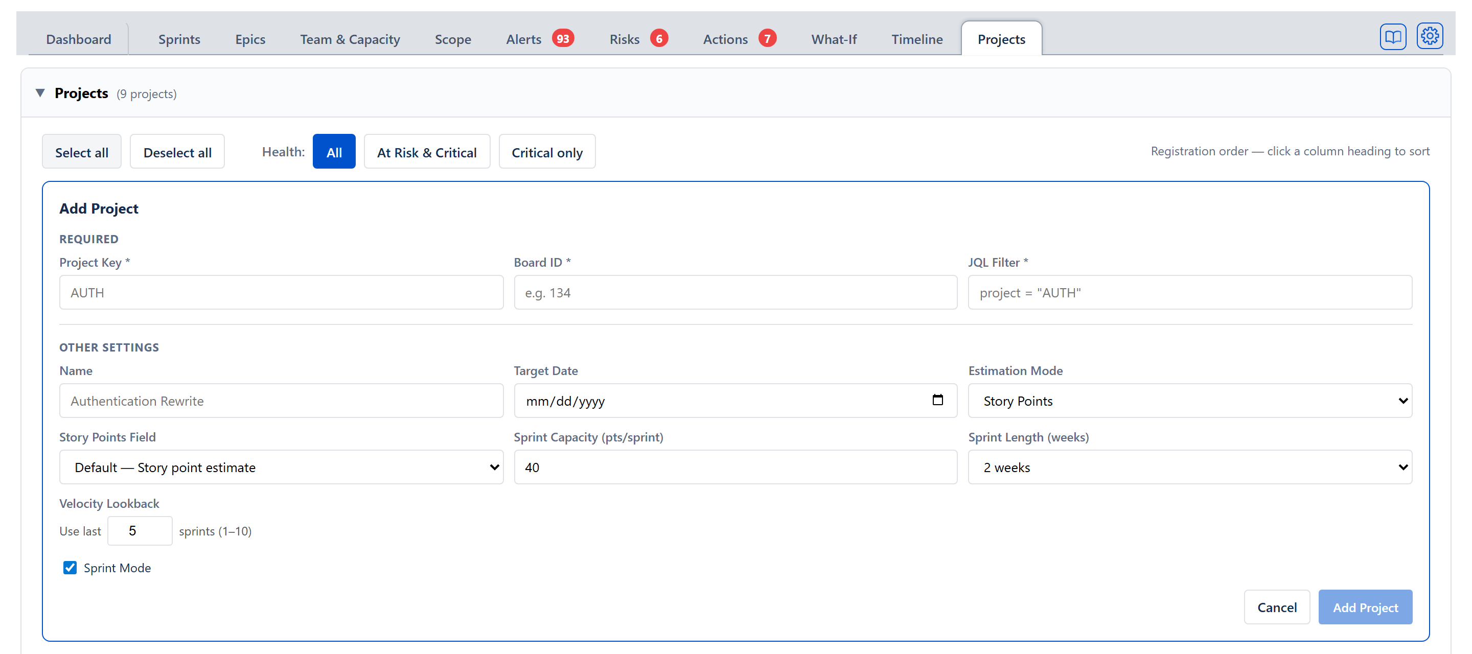
Later projects are added on the Projects tab with + Add Project. The form has the same key-first help: type the key and leave the field, and the name, filter, and board fill in the same way.
Under Required the form asks for three fields (two with Sprint Mode off):
- Project Key — a short uppercase id like AUTH. Checked against your Jira site as you leave the field.
- Board ID — the Jira board the app reads sprints and issues from; found automatically from the key for most projects. With the Sprint Mode box unticked this field is replaced by a note saying no board is needed, because the work comes from the JQL filter.
- JQL Filter — the Jira query that decides which issues belong to this project; pre-filled as "everything in this project", editable for narrower slices.
Everything under Other Settings is optional, with defaults you can change any time:
- Name — a readable label (defaults to the key).
- Target Date — the deadline the forecast is measured against (you can also set this later on the Dashboard).
- Estimation Mode — Story Points or Time. This sets the unit every screen uses for capacity and progress.
- Story Points Field — appears in Story Points mode. Most sites can leave the default, Default — Story point estimate; if your site keeps story points in a different Jira field (common for company-managed projects), pick it here — each choice in the dropdown says how many issues hold a value in that field, so the right one is easy to spot.
- Time Unit, Remaining Work and Hours per story point — appear in Time mode. Time Unit is Hours or Days (one day counts as eight hours). Remaining Work is Committed size (full until Done), the default, where an issue counts at its full estimate until it is Done, or Live estimate (after logged time), where it counts at Jira's remaining estimate, which shrinks as time is logged. Hours per story point converts issues that carry only a points estimate into hours.
- Sprint Capacity — how much work a sprint holds, labelled with its unit (for example Sprint Capacity (pts/sprint), default 40); with Sprint Mode off it reads Capacity per period.
- Sprint Length (weeks) — 1 to 4 weeks; with Sprint Mode off it reads Period Length (weeks).
- Velocity Lookback — Use last N sprints (1–10), default 5; with Sprint Mode off it reads Throughput Lookback, counted in periods.
- Sprint Mode — the checkbox at the foot of the form, ticked by default; untick it to treat the project as a continuous backlog instead of sprints. The same tabs are available either way: with Sprint Mode off the Sprints tab is renamed Tasks, and Risks, Actions and What-If all remain (What-If shows its Project and All Projects views, with no Sprint sub-view).
Fill in the required fields and click Add Project. To run more than one project, come back to this tab and add another; each project keeps its own settings. Every project row has Edit and Delete buttons.
2. Finding your way around
Once your first project is in, here's the layout:
- The tabs run across the top — Dashboard, Sprints, Scope, What-If, and the rest. Each answers a different question; this guide visits the ones a new user needs first. (They stay locked until that first project is added.)
- The project picker at the top right of the tab bar lets you switch between projects (each listed as key — name), or, once you have two or more, choose Program view to see every project rolled up into one. It is hidden on the Projects tab, which always lists every project.
- To the right of the picker sit small buttons, in this order: Ask (a speech bubble), which opens a panel that answers questions about the project; Guide (an open book), which opens this help site; and Refresh (circular arrows), which reads the project from Jira again in full. Refresh is not shown on the Projects tab or in demo mode.
- A gear at the far right of the tab bar opens the global Settings panel. It is not shown when the app runs as a gadget on a Jira dashboard, where Jira's own Configure control opens the same settings.
Ask the project a question
The quickest way to find out what the app knows about your project is the Ask button — the speech bubble in the tab bar, just right of the project picker, on every tab. Press it and a panel headed Ask, with the project key beside it, slides in from the right over whichever tab you are on, so the figures you were reading stay in view.
- The question box is at the top, with the line Every figure is worked out by the app. Nothing is written to Jira unless you say so. Before you ask anything, the panel lists Things it can answer: — for example Will we finish by 31 March 2027?, Which sprints are overcommitted? and What would one more person do? — and pressing one asks it.
- Every figure in an answer is worked out by the app's own forecasting and capacity calculations, the same ones the cards on every tab use, so the same question gives the same numbers every time, whether or not an AI is set up.
- A what-if (such as one more person) changes nothing in Jira; while one is in force an amber line says so, with Back to the plan as it stands beside it. Clear empties the panel.
- Anything the panel can change in Jira takes two presses: the first says exactly what the second will write, with Leave it beside it.
- Ask is in the app installed in Jira, including its Jira dashboard gadget. The web app at projectcommander.app and demo mode do not have it.
The Ask Panel Guide has the full list of what it answers, what it can change, and what it refuses.
3. See your work in the Sprints tab
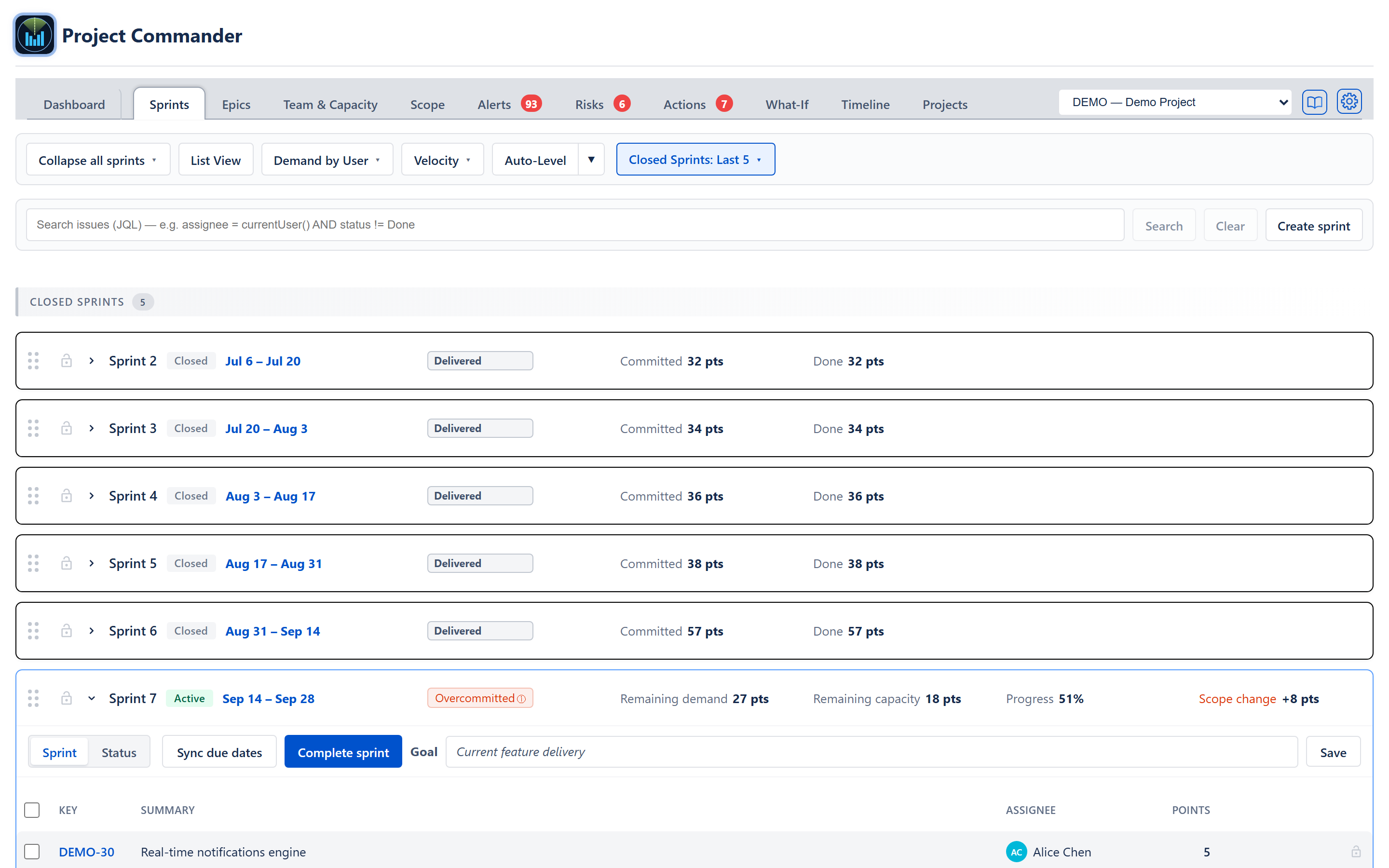
Open the Sprints tab to see your work laid out by sprint. Each sprint is a card showing demand against capacity — how much work is in the sprint against how much the team can do — and a badge that reads Deliverable, Tight, or Overcommitted (a closed sprint reads Delivered when everything it committed was finished, or Delivered N of M when it was not, beside its Committed and Done figures). On the sprint currently running, the stats read Remaining demand and Remaining capacity — the open work against the capacity left in the sprint's remaining days. That badge is the at-a-glance answer to "is this sprint realistic?"
Click a sprint card to expand it. You'll see the sprint goal, the per-person Team & Capacity breakdown, and the full issue table, where you can edit assignees, points, status, and dates inline.
4. Tell the app about your team's capacity
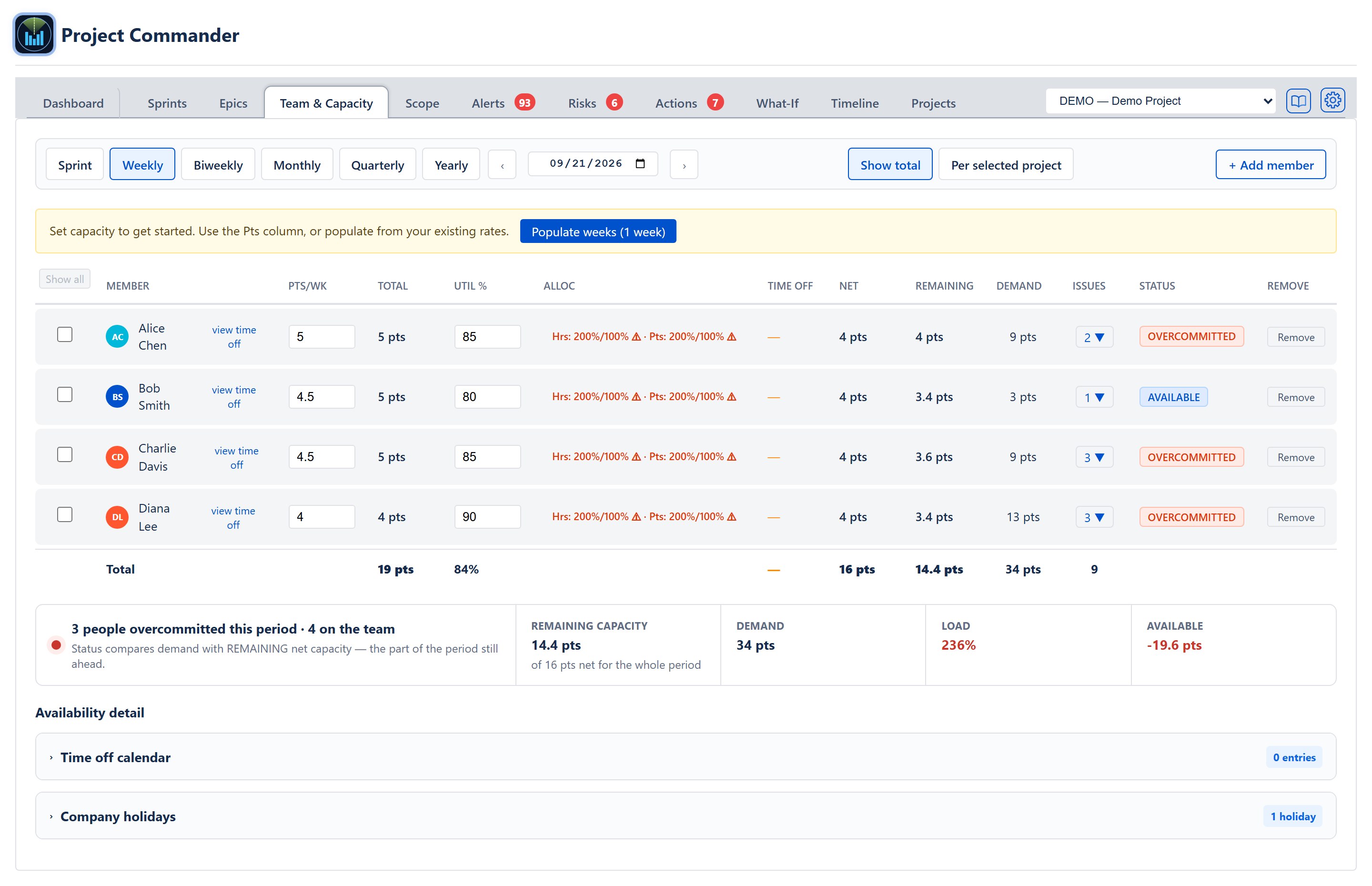
The forecast is only as good as the capacity behind it, so set your real team up on the Team & Capacity tab. Use + Add member to add each person, then type their capacity per week in the Pts/Wk column (Hrs/Wk on a project estimated in time — with the Weekly period button selected) and their utilisation in the Util % column. You can also record time off (the view time off link beside each name, and the Time off calendar under Availability detail) and Company holidays, which the app subtracts so the forecast doesn't assume people are available when they aren't.
The number that matters most is the Net column — capacity after utilisation and time off. That's the figure the forecast and the feasibility verdicts on every other screen actually read.
If you run more than one project, also set each person's per-project allocation — the share of their capacity that goes to each project. On the Team & Capacity tab, click a person's figure in the Alloc column to open their Project allocations and type a percent for each project; the Team Allocation Matrix on the Projects tab holds the same figures. Someone split 60% / 40% across two projects only contributes that share to each project's forecast, so a project whose allocations are left blank can read low or even zero capacity even though the people are set up. Points and hours are allocated separately: a project estimated in points reads the points percentage, one estimated in time reads the hours percentage. With a single project you can skip this — everyone counts in full for it.
5. Set the target date
Go to the Dashboard. The Target Date card (the blue one) shows the deadline everything else is measured against. Open its gear to choose how that date is set: Latest issue due date (the default — the app uses the latest due date across your unfinished issues) or Fixed date (you pick an explicit deadline). You can also set a project's target date on the Projects tab Edit form; they're the same target.
6. Choose how the finish date is forecast
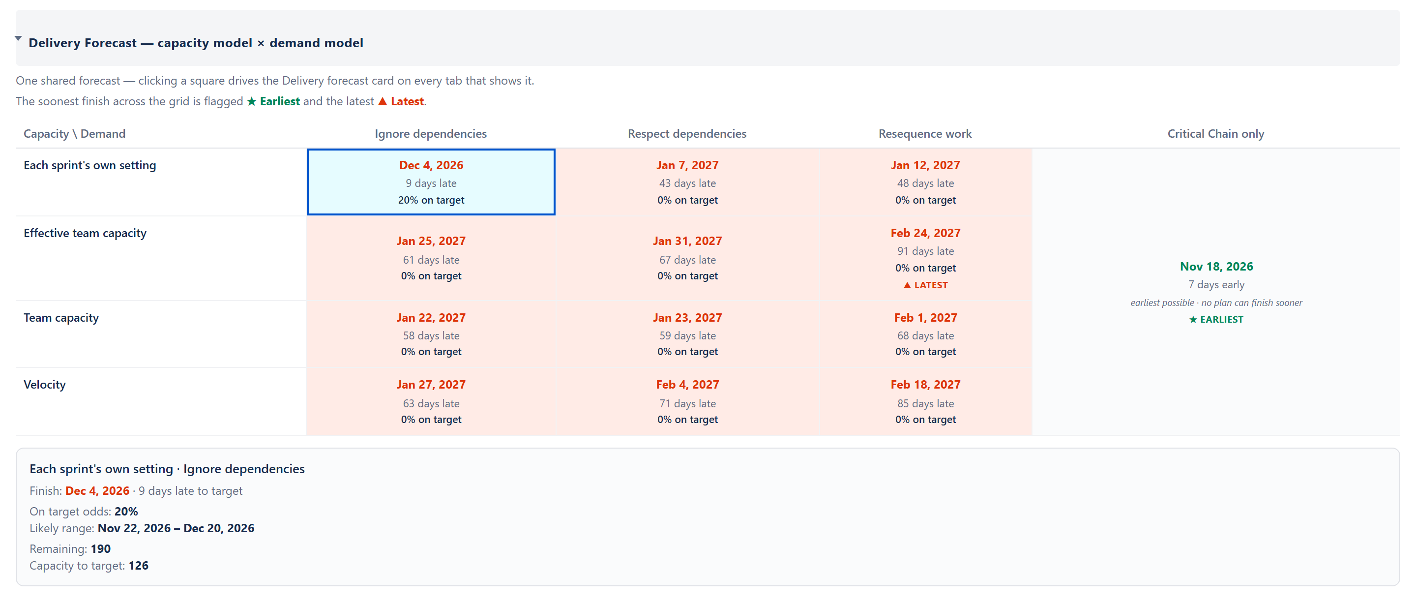
Still on the Dashboard, the Delivery Forecast card shows the projected finish date for all remaining work, the on-target odds, and a likely-finish range. Open its gear to choose the two models that drive that date:
- Capacity model — how the app counts how fast the team works: Each sprint's own setting, Effective team capacity (the Team capacity sum reduced by the team's efficiency — finished work as a share of committed work, averaged over closed sprints; with no closed sprints to measure, nothing is taken off and it reads the same as Team capacity, and the card says Efficiency not measured yet — nothing discounted), Team capacity (the sum of everyone's capacity from the Team & Capacity tab), or Velocity (a rolling average of recent sprints). With Sprint Mode off the choices are Capacity per period, Team capacity, Effective team capacity and Throughput (work finished per week).
- Demand model — how the app orders the remaining work: Ignore dependencies, Respect dependencies, Critical Chain only (the earliest the blocking chain alone allows), or Resequence work.
- Scope growth method — a checkbox, off by default; tick it to have the forecast assume work keeps being added, either at your project's own historical rate (Average) or a rate you type (Manual).
Below the cards, open the section headed Delivery Forecast — capacity model × demand model (or click See detail below on the card) to see every pairing at once — each with its finish date, its gap to target, and its on-target odds, shaded green (70% or better), amber (50% to 69%) or red (below 50%). Click any cell to make that pairing drive the card above. The demand model you pick is shared with the Scope and What-If tabs, so the same choice means the same thing across all three.
7. Review the Sprints tab for problems
Now read for trouble. On the Sprints tab, look for any sprint with an Overcommitted badge — that sprint is carrying more work than the team can finish. Inside a sprint, a warning icon on an issue means it's either bigger than the whole sprint's capacity or blocked by work that sits in a later sprint (so it can't actually start on time). These are the spots most likely to slip.
8. Review the Scope tab for problems
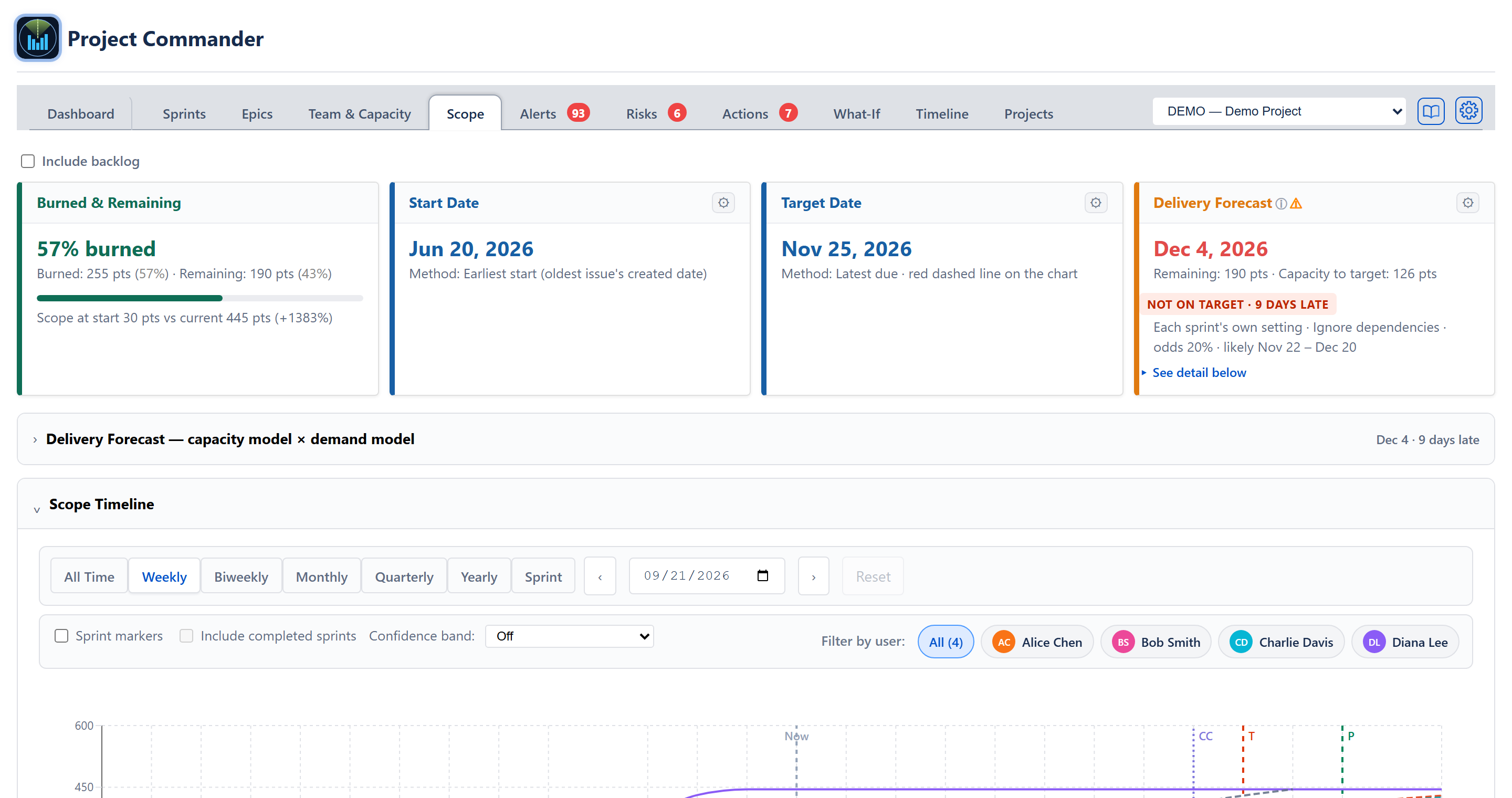
Open the Scope tab to see whether the work is burning down fast enough to hit the target. The chart draws what's left over time (the Remaining line) against an Ideal Burndown line to the target date, plus a forecast line, named for the demand model in use, that projects where you'll actually land; a T marks the target date and a P marks the projected finish. If the forecast line lands well past the target, or the Scope Growth line (drawn when scope growth is switched on) is climbing, you've found a real risk. The same Delivery Forecast card from the Dashboard sits here too, so the projected date matches exactly.
9. Test a plan on the What-If tab
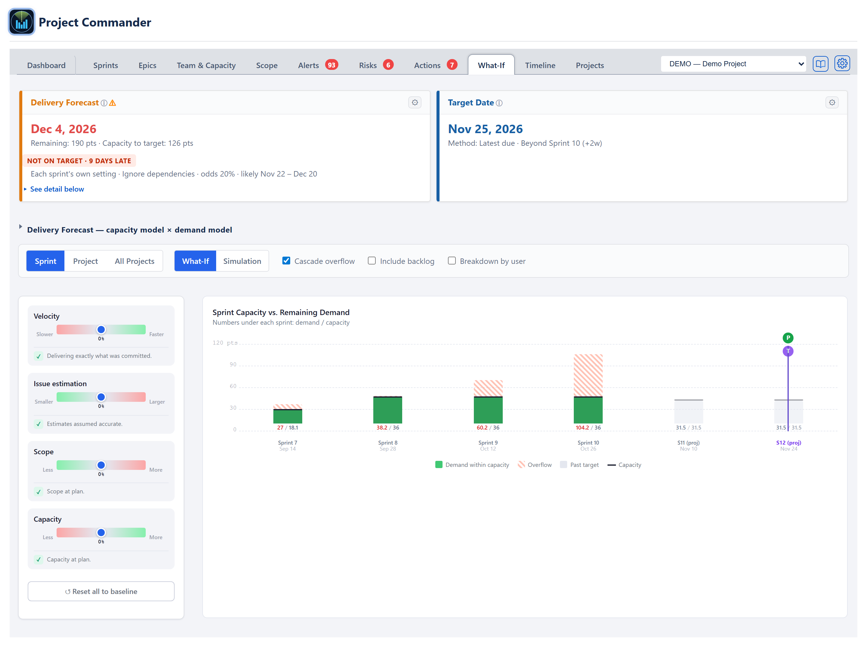
Finally, the What-If tab is the sandbox for "what would fix this?" — nothing here touches your real Jira data. Drag the four sliders (Velocity, Issue estimation, Scope, Capacity) and watch the forecast and the chart move live. Flip the switch from What-If to Simulation to get the odds of finishing on time across many runs. With an AI key set in Settings → AI Features, the Ask a What-If Question box under the chart turns a plain question like "what if we add a developer?" into slider settings. The three sub-views — Sprint, Project, and All Projects — let you test one sprint, the whole project on a weekly timeline, or every project rolled up together.
10. Where to look next
- The Dashboard's Top Open Risks widget lists the project's highest-score open risks — a fast standup-prep view.
- The Alerts tab surfaces dependency conflicts, including work blocked by something scheduled later and circular dependencies.
- The Risks tab tracks the biggest threats to delivery, with AI-suggested risks you can accept in one click.
- Each tab has its own feature guide with the full detail; this guide is just the on-ramp.