 Project Commander Docs
← Back to site
Project Commander Docs
← Back to site
What-If Tab — Feature Guide
What it's for
The What-If tab is the project's sandbox: a place to test how velocity changes, estimate inflation, scope growth, and capacity changes affect the delivery forecast — without touching real data and without writing anything back to Jira. It pairs what-if sliders (one value each) with a Simulation mode (Monte Carlo, thousands of runs drawn from ranges). The AI question boxes that used to sit under the charts were taken out on 6 October 2026, with every other place the app asked an AI model; every figure on the tab is worked out by the app itself.
The audience is delivery managers, programme leads, and product owners who need to answer questions like what if we lose Alice for the next sprint?, what if scope grows 20%?, or what if we add a developer? The tab makes the answer visible as a cascade chart, a probability curve, or the numbers on the forecast cards — and the slider positions are forgotten as soon as the user leaves the tab.
The tab has three sub-views — Sprint, Project, and All Projects. The Sprint and Project sub-views show the same Delivery Forecast card, Target Date card and capacity model × demand model grid the Dashboard draws, so the same number means the same thing everywhere. All Projects draws its own build of those two cards and rolls the whole program up; in Simulation it reports the program's odds and which project is the weakest link.
Sub-views (Sprint / Project / All Projects)
Three buttons switch between the sub-views. They sit at the start of the tab's one row of controls, before the What-If / Simulation switch:
- Sprint — the sprint-level view: steps through the actual sprints.
- Project — the weekly view: steps by calendar week (Monday to Sunday) from issue due dates, so it works even when a project is not run on sprints.
- All Projects — the whole-program rollup: no timeline, every project rolled up into one program forecast (see the All Projects view section below).
- Sprint appears when a single project is selected, that project has sprints, and Sprint Mode is on. In the program view (Program view chosen in the project picker) the Sprint sub-view is unavailable, because sprint cadences from different projects cannot cascade together and the program forecast comes from the one shared rollup (the All Projects sub-view). Project appears whenever any issue is loaded (a due-date empty state appears inside it if none have dates). All Projects appears whenever there is at least one project in scope.
- When only one sub-view is possible the three buttons are hidden and that sub-view loads automatically.
- Each sub-view has its own What-If / Simulation switch, next to the sub-view buttons on that same controls row. Only the sub-view on screen is kept; switching to another sub-view and back resets that view's sliders and ranges to where they start.
The controls row
One horizontal row sits under the forecast cards (and, on the Sprint and Project sub-views, under the capacity model × demand model grid) and above the sliders, on every sub-view. Left to right: the three sub-view buttons, the What-If / Simulation switch, then the display choices.
- Cascade overflow (on by default) — work that does not fit a period spills into the next one. Untick it to see each period on its own. Sprint and Project sub-views. It is not saved: leaving the tab turns it back on.
- Include backlog (off by default) — count issues that sit in no sprint. All three sub-views, and it is the same project-wide setting the Dashboard and Scope tabs read, so changing it here changes it everywhere.
- Breakdown by user (off by default) — split each chart bar into a segment per assignee. Sprint and Project sub-views. It is saved with the project, so it stays as it was left.
The All Projects sub-view offers Include backlog only: it has no timeline and no chart, so there is nothing for the other two to act on.
Sprint view
Sliders
Four horizontal sliders, range −50% to +50% in steps of 1%. Each is labelled at both ends with what moving it means, and carries a line beneath saying what the current position assumes:
- Velocity (Slower … Faster) — scales sprint capacity. Negative = team running slower than recent history; positive = faster. At zero it reads ✓ Delivering exactly what was committed.
- Issue estimation (Smaller … Larger) — scales sprint demand. Negative = work smaller than estimated; positive = larger. At zero it reads ✓ Estimates assumed accurate.
- Scope (Less … More) — scales sprint demand. Negative = backlog tightening; positive = scope growth. At zero it reads ✓ Scope at plan.
- Capacity (Less … More) — scales sprint capacity directly. Negative = absences / context-switching; positive = headcount or efficiency. At zero it reads ✓ Capacity at plan.
The All Projects sub-view offers the same four sliders with the same names. The Project sub-view has the same four, but its second slider is labelled Issues estimation.
Velocity and Capacity multiply together when both are non-zero: each person's capacity is multiplied by (1 + Velocity %) and by (1 + Capacity %), so +10% Velocity and +10% Capacity give 21% more capacity, not 20%. Issue estimation and Scope multiply together on the demand side in the same way.
Dragging any slider re-runs the cascade and moves the forecast cards immediately. Nothing is saved — there is no save button, and nothing is written to Jira.
Breakdown by user
A Breakdown by user checkbox (off by default) on the controls row splits each cascade bar into per-assignee demand segments instead of one aggregate bar, so you can see whose work sits in each sprint. It changes the picture only — the four sliders still apply to everyone; there is no per-person slider. A Reset all to baseline button below the sliders returns every slider to zero.
Cascade chart
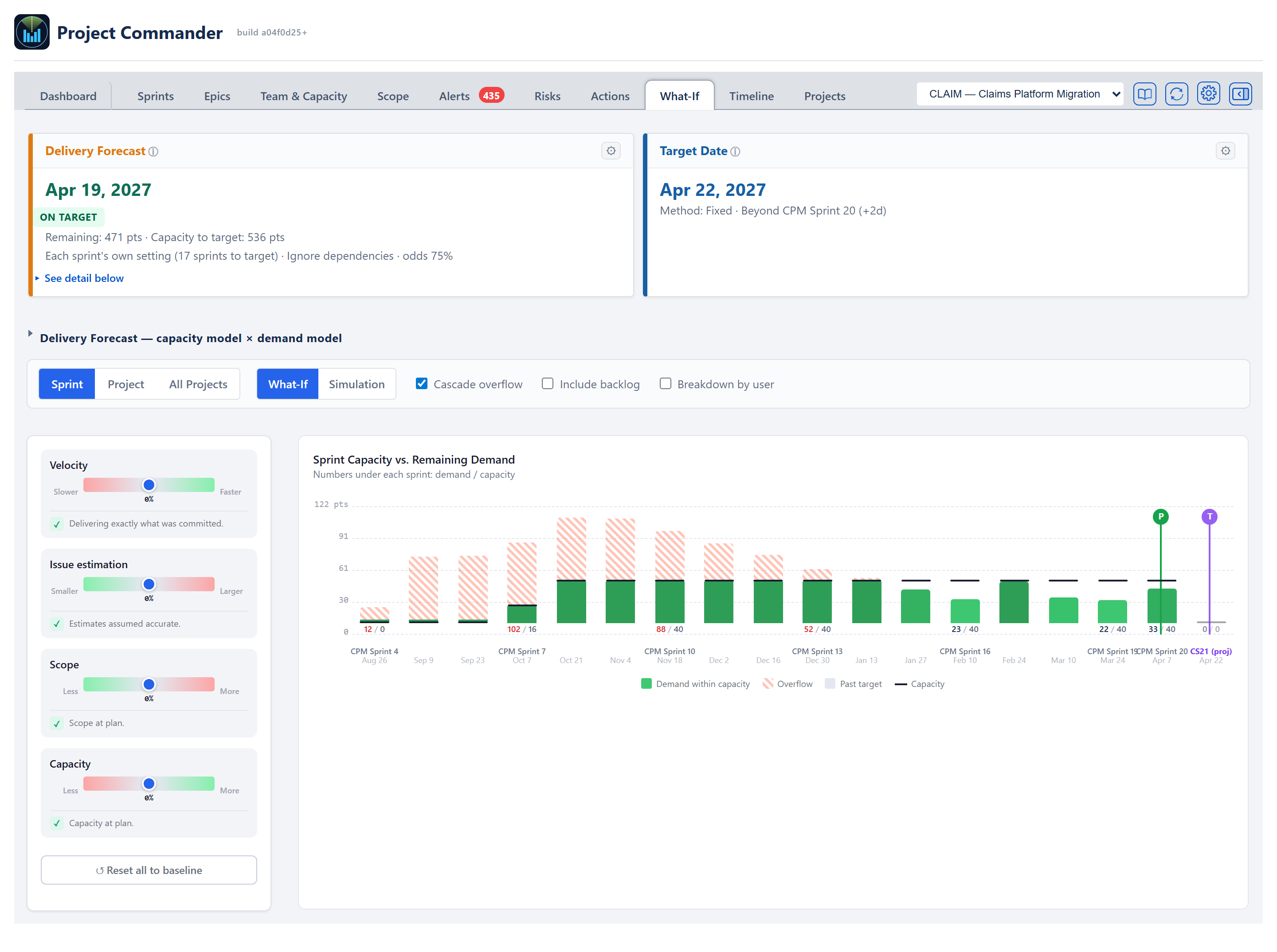
The chart is headed Sprint Capacity vs. Remaining Demand, with the line Numbers under each sprint: demand / capacity. One column per sprint along the bottom, in calendar order (sorted by sprint start date — a Jira board's own list order is not always chronological, and the chart never follows it); demand up the side in pts, hrs or days.
- Bars — by default each sprint is one bar of demand, green while it fits the sprint's capacity (a deeper green the fuller the sprint is). Ticking Breakdown by user stacks it by assignee in a fixed colour per person with an Unassigned segment in grey; a person whose own demand is over their own capacity has their segment cross-hatched in red.
- Numbers under each column — the demand and capacity figures, demand / capacity, with demand in red when the sprint is over capacity.
- Capacity line — a thin horizontal mark inside each column at the sprint's capacity. For the ACTIVE sprint this is its remaining capacity — the capacity in the days still ahead, the same figure the Sprints tab header shows (ruling 2026-07-10) — so a half-finished sprint shows a roughly half-height line and its over/under read matches that header. A sprint Jira still marks future whose dates have passed shows no capacity line at all — it was never started and its days are gone (decision 2026-09-03) — which is what the Sprints tab header and the Delivery Forecast card say of it too.
- Overflow — with Cascade overflow ticked (the default), a sprint that is over capacity is drawn as a green part that fits under the capacity line and a red cross-hatched part above it, the work spilling into the next sprint. Untick it and each sprint is shown on its own with no spillover carried, and a sprint over capacity is drawn solid red.
- Projected columns — when the target date (or the projected finish) falls past the last planned sprint, the chart adds grey columns after it, numbered on from the last sprint and marked (proj) (for example Sprint 11 (proj)), so the T pin can land on its real date. They are calendar only: they hold no capacity and no demand, because the forecast counts only the capacity the plan has (6 October 2026; until then they carried the leftover work at the plan's average capacity, which nobody had planned). Work that does not fit stays as overflow on the last planned sprint. The timeline never goes blank: every column from the first bar through the target (and the projected completion) stays visible — including zero-demand planned sprints and empty projected columns — and every column always shows its calendar date, planned sprint or not. When the chart has many columns, the sprint names and the demand/capacity numbers thin out to every 2nd–4th column for width, but the dates never do.
- Markers — a vertical purple line marks the Target column; a vertical line marks the Projected completion column at the Delivery Forecast card's date, green when the card says on target and red when it says late. When the card gives no finish (Does not fit the plan or Never), no P is drawn.
- Past target — columns after the target column are drawn grey.
(Ghost "baseline" bars behind the bars are a feature of the Project view's chart, not this Sprint-view cascade.)
A legend below the chart names what is drawn. With Breakdown by user off it reads Demand within capacity, then Overflow (Cascade overflow on) or Demand over capacity (Cascade overflow off), then Past target and Capacity. With it on, it lists each person by colour, Unassigned when there is unassigned work, and Overloaded, then Past target and Capacity.
Forecast cards + comparison grid
Across the top of the tab — above the controls row, in both What-If and Simulation modes — sit the same Delivery Forecast card and Target Date card as the Dashboard (the On Pace? and Progress cards are hidden, and the two are widened to fill the row). They stay on screen in Simulation so the Target Date card's gear is always within reach. That gear and the Target Date field on the Projects tab's Add / Edit Project form set the same date: a project's target lives in one place, its own record, and every screen reads it from there (2026-09-03). The Delivery Forecast card carries the projected finish date, work remaining and capacity to target on one line (clipped at the target date — when the plan holds capacity beyond the target, an extra line states N pts capacity available after target date), the on-time verdict, and one line with the chosen capacity model, demand model, the on-target odds and the likely-finish range — plus the terminal labels Complete, Does not fit the plan and Never. Does not fit the plan means the planned sprints end with work still left: the forecast walks only the planned sprints and carries nothing past the last one, and a red line under the figures says how much does not fit and roughly what to add (for example 63 pts don't fit in the planned sprints. To finish by Dec 19, 2026, add about 2 more sprints at 36 pts, or more capacity.). No odds and no likely range are shown beside it, because there is no date to have odds about. The odds and the range come from the simulation's own runs, never slid onto the card's date. Anything the forecast counts — the backlog when Include backlog is on — moves the date, the odds and the range together. The same amber notices as the Dashboard card apply here: Efficiency not measured yet — nothing discounted when the Effective capacity model has no measured history, and, when the Team or Effective model comes out at zero while work remains, the sentence saying which of the three states it is — no sprint dates, nobody on the Team & Capacity tab, or people there with no capacity typed. When the date needs explaining, an amber ⚠ mark sits straight after the card title, as on the Dashboard — for example This date leaves out 37 pts, for work held by someone on the Team & Capacity tab who has no capacity. The gear on the card opens the capacity-model, demand-model and scope-growth controls. Critical Chain only is not offered in the card's demand-model dropdown: it is a floor that ignores capacity, not a forecast, so it never drives the card; it still appears as a column of the comparison grid below. The card's See detail below link, and the collapsible Delivery Forecast — capacity model × demand model section beneath the cards, show every pairing at once. On this tab the section is drawn only when the comparison could be worked out; when it could not, the section is not shown. Since 2026-09-04 the cards, the grid and every number behind them are the one component the Dashboard draws — computed once, drawn once — so the two tabs cannot disagree. The sliders move all of these live with each drag, exactly as they move the cascade chart.
On the cascade chart itself, the purple T pin marks the target date and the P pin marks the projected delivery (the same date as the Delivery Forecast card) — both state their calendar dates on hover, and both are placed by one shared date-to-column rule, so a target beyond the last planned sprint lands on a projected column instead of snapping back onto the plan. The dashed vertical divider separates the plan from everything after the target date (hover it for the target date), and columns right of it are grey as past-target.
A yellow notice sits at the very top of the tab when team members are set up but none of them are allocated to this project: N team members are set up, but none are allocated to this project — so Team capacity for it reads 0 and team-based forecasts stall. It goes on to point at the Team Allocation Matrix on the Projects tab, naming the project's own unit (in pts, in hrs or in days). The matrix there shows the allocations; they are changed from the Alloc column of the roster on the Team & Capacity tab.
Per-slider risk statement
Each slider has a one-line plain-English statement that updates as the user drags. The statement names the affected sprint (e.g., Underperforming. Overflow begins in Sprint 6, completion pushed to Sprint 9.) so the consequence of the slider change is always one glance away. When the Delivery Forecast card gives no finish, the statement names no completion sprint and says so instead — Underperforming. Overflow begins in Sprint 6; the work does not fit in the planned sprints., or Outperforming. Even so, the work still does not fit in the planned sprints. The statements are shown in What-If mode only.
Simulation (Monte Carlo) mode
Switching to Simulation mode replaces each single-value slider with a low–high range (a slider with two handles, captioned for example Velocity range and −15% to +10%) and replaces the cascade chart with a probability curve. The forecast cards stay at the top.
Uncertainty ranges
In Simulation mode each variable is a low–high range rather than a single value. On the Sprint and Project sub-views the ranges start at velocity −15% to +10%, issue estimation −10% to +15%, scope −5% to +15%, capacity −15% to +10%, and can be adjusted; Reset all to baseline below them puts them back. There are no Conservative / Realistic / Optimistic preset buttons. (The All Projects sub-view starts every range at −15% to +15%; see below.)
Probability chart
The chart is headed Delivery Probability Distribution. Along the bottom are the sprints (fractional half-sprint steps allowed), with the sprint name and start date; up the side is the chance of having finished by that sprint (Likely on target).
- The chart is built by running the cascade many times — 2,000 runs in the Sprint sub-view and 5,000 in the Project sub-view — with each run drawing values randomly inside the ranges.
- Each run applies a 50/50 split between one team-wide draw (everyone has a similar good or bad sprint) and a separate draw for each person (individuals still vary independently).
- The curve is smoothed through the counts so it reads as a curve rather than steps.
- A dot labelled 85% marks where the curve crosses 85% (the planning-safe point) — blue on the Sprint sub-view, green on the Project sub-view; a purple dot marks the target with its N% on target label.
Simulation KPI row
Above the curve:
A one-line verdict sits above the numbers on both the Sprint and Project sub-views: Target likely / Target uncertain / Target very unlikely, followed by how many runs were made, what the sub-view steps by, and the four ranges they were drawn from — 2,000 runs · stepped by sprint · … and 5,000 runs · stepped by calendar week from issue due dates · …. The verdict reads from the same on-time bands as Finish on Time? beside it, so the two can never disagree; and because each line names its own basis, the two sub-views giving different odds for one project explains itself.
The sprint the odds are measured against is the project's target date resolved to a column — the same shared computation the Target Date card shows, extending past the last planned sprint when the target falls beyond the plan; only when no target date exists does it fall back to the last sprint with demand. There is no separate target control on this tab: the Target Date card's gear is the one place the target is set, and that card stays on screen in Simulation mode.
- On-target probability — % of runs that finished on or before the target, with by and the target column's name beneath. Green 70% and above, amber 50–69%, red below 50%.
- Finish on Time? — Yes / Maybe / No from that same probability, with N% of runs on target beneath.
- Expected slip — average sprints late among runs that missed, shown as None or +N sprints, with the share of runs that missed beneath; green when none, amber up to 1 sprint, red above.
- Deliverability — a 0–100 plan-deliverability score banded High / Medium / At Risk / Critical (ALGORITHMS section 8); reacts to the sliders like the other cards.
On the Project sub-view, the weekly chart and the Delivery Forecast card above it are meant to share one weekly capacity rate (ruling 2026-07-09): each week's capacity comes from the same team figures, and the card's Capacity to target adds up the weeks between today and the target (clipped at the target; the current week — and, with sprints on, the active sprint — contributes only the part still ahead, ruling 2026-07-10). The chart counts the current week's WORKING DAYS still to come (9 October 2026), so a day already gone contributes nothing and a day booked off that is already past takes nothing off what is left. With Sprint Mode ON the card's forecast now reads the active sprint the same way — what the people's typed weeks leave in the days still to come — so the two agree mid-sprint; until 9 October 2026 it took the share of the sprint's calendar time still to run and they could differ by a fraction of a week's capacity. With Sprint Mode OFF the plan is walked in planning periods rather than sprints, and since 9 October 2026 the period the project is in now is read the same exact way — what the people's typed weeks leave in the working days of it still to come (Don: "Fix it for projects without sprints") — so the two agree there as well. Where a period's capacity is the project's own Sprint Capacity number, or nobody on the Team & Capacity tab has a capacity typed, there are no weeks behind it to read: that period is clipped by the share of its calendar time, and on a part-spent week the two can still differ by that much. When every week carries the same capacity, the chart's weekly capacities up to the target add up to the card's figure. Where people's hours differ week by week, or time off falls in the window, the weekly figures are not all the same.
Project view
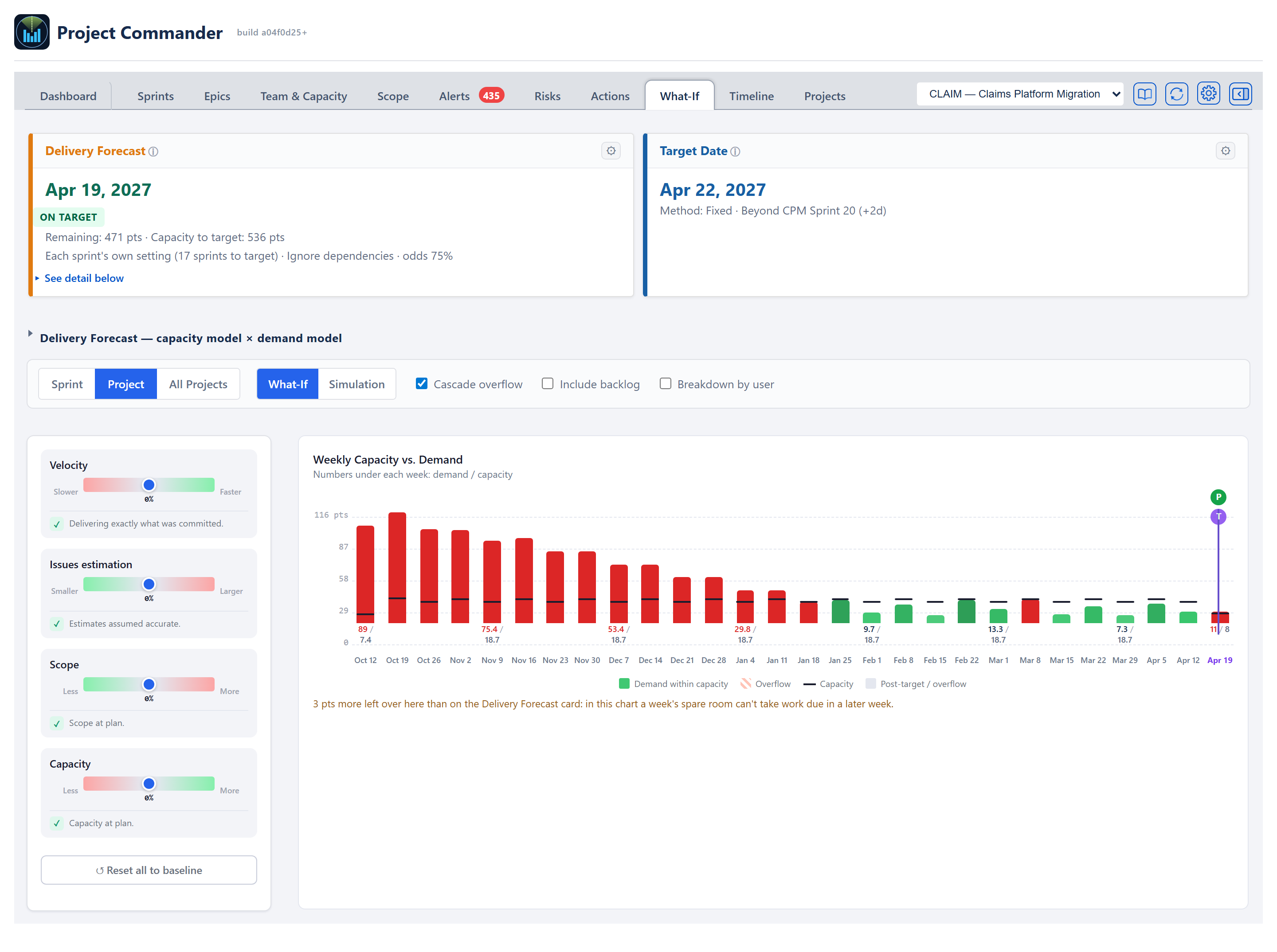
Same cards, controls and sliders as the Sprint view. The chart is headed Weekly Capacity vs. Demand, with the line Numbers under each week: demand / capacity; its columns are calendar weeks (Monday to Sunday), each labelled with its Monday's date. The weeks run from this week to the week of the latest issue date (at most 52 weeks) and, on a project with open sprints, on to the end of the last sprint, so every week the plan holds capacity in is drawn even when nothing is due in it; overdue work lands in the first week. An issue's demand is placed by its due date — an issue with no due date of its own takes the end of the sprint it is in, the same due-date rule every tab uses. When an issue has both a start date and a due date, its demand is split evenly across every week from the start week to the due week; an issue with only a start date is placed in its start week.
Each week's capacity is taken from the Delivery Forecast card's own plan: a week holds its share of the capacity of the sprint it falls in, spread over that sprint's days still ahead, and a week after the last sprint holds none (6 October 2026). So the weekly capacities up to the target add up to the card's Capacity to target. Because each issue stays in the week it is due, a week's spare room cannot take work due in a later week; when that leaves more over than the card says, a line under the chart (with Cascade overflow ticked) says by how much — N pts more left over here than on the Delivery Forecast card: in this chart a week's spare room can't take work due in a later week.
On this chart a week that is over capacity is drawn as a solid red bar, whether or not Cascade overflow is ticked. Weeks after the target, and projected weeks past the last dated week, are grey (the legend calls them Post-target / overflow); projected weeks hold no capacity and no demand, and no P marker is drawn when the card gives no finish. Once any slider is moved away from zero, faint Baseline bars and capacity marks behind each week show where it stood with every slider at zero.
Critical Chain only can no longer be chosen to drive the Delivery Forecast card, so the four sliders always move the date and are never greyed out.
Undated issues alert
Issues with neither a due date nor a start date can't be placed on the weekly timeline, so they are called out in a small ⚠ alert above the chart — "N issues without dates — not shown in the chart." — listing the issue keys when there are ten or fewer, rather than dropping them silently.
Simulation result cards
Switching the Project view to Simulation mode runs a Monte Carlo forecast and shows four cards above the probability chart. The week they are measured against is the project's target date resolved to a week; as on the Sprint sub-view there is no separate target control here, because the Target Date card at the top of the tab is the one place the target is set. The four are On-target probability (the share of simulation runs that finish by the target week, with by and that week's date beneath), Finish on Time? (Yes / Maybe / No read from that same run probability at the shared 70%/50% bands — the identical rule the Sprint sub-view uses, so it reacts to the sliders), Expected slip (the average delay past the target across the runs that missed it, shown as None or +X weeks, with the percentage of runs that missed), and Deliverability (a 0–100 plan-deliverability score banded High / Medium / At Risk / Critical — capacity vs demand, delivery timing, over-capacity periods, and overflow; the rule is ALGORITHMS section 8).
All Projects view
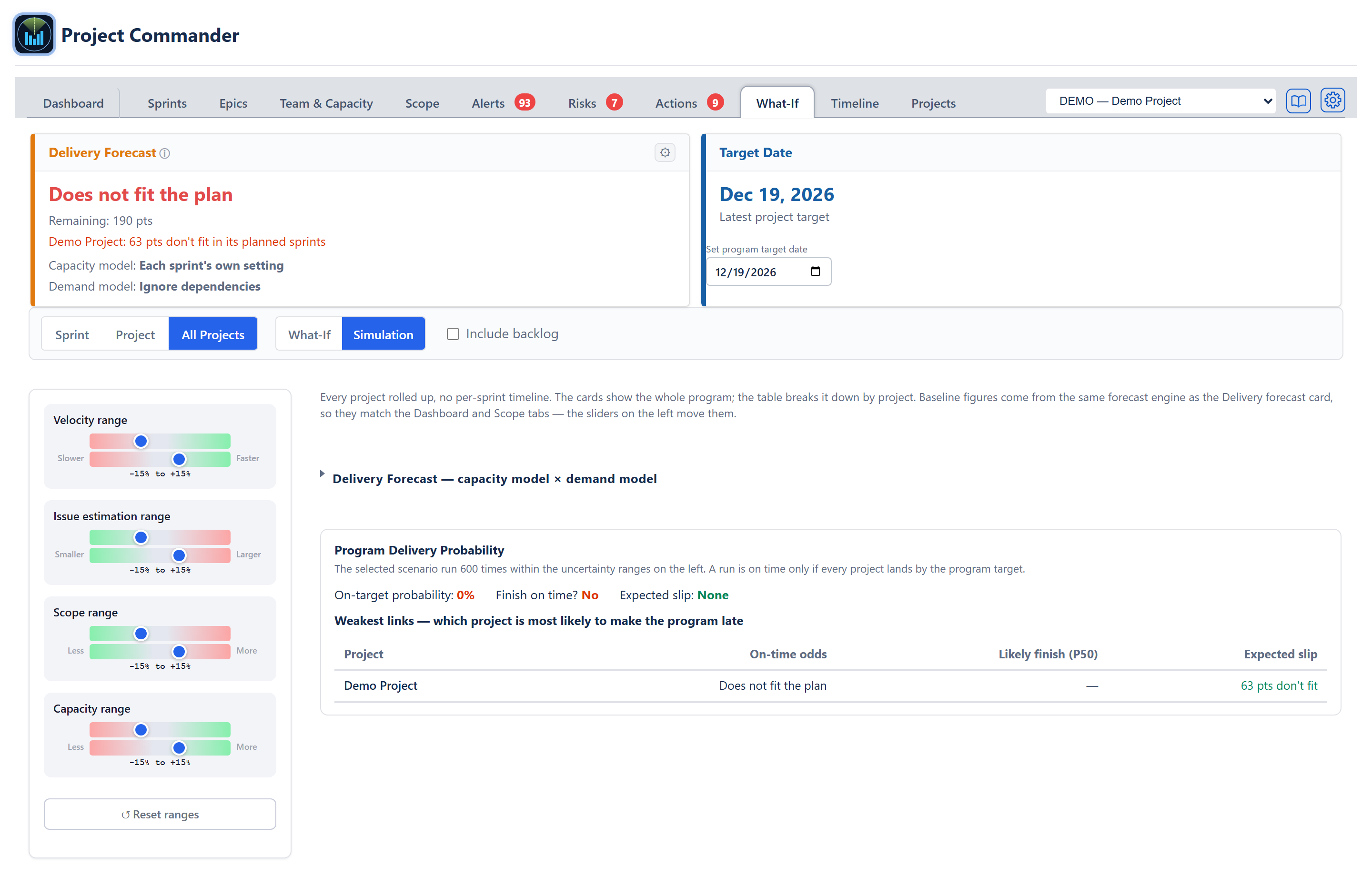
The third sub-view has no timeline — it rolls every project up into one program forecast, the same rollup the Dashboard's Program View and the Scope program view use. It follows the project picker at the right-hand end of the tab bar: with Program view selected it covers every registered project; pick a single project and it shows just that one.
The What-If / Simulation switch sits on the shared controls row, the same as the Sprint and Project sub-views, with Include backlog beside it.
What-If mode
- The left column has the four sliders (Velocity, Issue estimation, Scope, Capacity) and a Reset all to baseline button, which is greyed out while every slider is at zero. There is no per-slider statement on this view.
- Across the top are this view's own Delivery Forecast card and Target Date card. The Delivery Forecast card reads the program finish (the latest project to finish, noted Latest project to finish), Remaining: and Capacity to target: (per unit, so points and hours never mix), On target or Not on target · N days late, Capacity model:, Demand model:, On target odds: and Likely finish:. Its capacity model reads "Per project" for a multi-project rollup. When a project's work does not fit in its planned sprints the card reads Does not fit the plan in red, with a line naming that project and how much does not fit (for example Claims Platform: 21 pts don't fit in its planned sprints, or planned periods for a project without sprints) and no odds; when the program cannot finish the card reads Never with Scope outpacing delivery. Its gear offers the capacity model (including Per project when there is more than one project), the demand model (Critical Chain only is not offered there, because it never drives the card; it stays in the grid), and Scope growth method — a tick box that applies one scope-growth assumption (Average or Manual, at a rate per week) to every project; unticked, Each project uses its own setting. The Target Date card defaults to the latest of the projects' own targets (Latest project target), and is editable on the card in the field Set program target date: typing a date sets a fixed program target (Fixed program target) that the program forecast, the comparison grid, the on-target odds, and Simulation on this view all honor; Reset to auto returns to the latest project target. It is the same program target the Dashboard's and the Scope tab's program views measure against, described in the same words, and the gear on the Dashboard's program-view Target Date card sets it too.
- The collapsible Delivery Forecast — capacity model × demand model grid rolls every pairing up across the projects. It starts closed; clicking a square sets the card, the program total and the table's Forecast column to that pairing.
- A per-project table lists each project's Demand (work remaining), Capacity (to the target), and Forecast (projected finish), with a Program total row per unit. A project that cannot finish reads "Never" and one whose work does not fit in its planned sprints reads "Does not fit the plan", both in red; the Program total row reads the same when no date can be given, and "Complete" when all work is done. A line beneath explains the three columns.
- The four sliders run through the same forecast calculation the single-project views use, so a project's numbers match its own Sprint / Project / Dashboard views at every slider position.
Simulation mode
Flipping to Simulation swaps the sliders for uncertainty ranges (two sliders per variable, low and high, each range starting at −15% to +15%, with a Reset ranges button) and replaces the per-project table with the Program Delivery Probability panel. Its first line says how many times the selected scenario was run (600) and that a run is on time only if every project lands by the program target.
- On-target probability — the share of runs in which the whole program finishes by the program target.
- Finish on time? — a plain Yes / Maybe / No read from that probability.
- Expected slip — how far past the target the late runs land on average, shown as None or +N wks.
- Probability curve — the chance of being finished by each date, with the target marked.
- Weakest links — which project is most likely to make the program late — a table of each project's On-time odds, Likely finish (P50) and Expected slip, worst first, so the project dragging the program down is at the top; a project that can never finish sits at the very top, marked Never, with no capacity as its slip; a project whose work does not fit in its planned sprints reads Does not fit the plan in place of its odds, with how much does not fit (21 pts don't fit) in place of its slip.
The program odds work by forecasting each project on its own, running the sprint-based ones many times, and combining them so that in each run the program finishes with its latest project. If no project in the program runs on sprints with a team, no probability is shown; the panel says Add at least one project that runs on sprints to see delivery odds — the simulation needs a sprint cadence to vary against. Each project is forecast on its own team's capacity, with that project's allocation from the Team Allocation Matrix (Projects tab) applied — so a person split across projects is counted at their allocated share, not at full capacity on each.
Cross-cutting modes and empty states
- No data — Sprint view — No Sprint Data — Configure sprints or enable Test Mode to see risk analysis.
- No data — Project view — No Plan Data — Configure JQL or enable Test Mode to see plan risk analysis.
- No dates — Project view — Issues Need Due Dates — Plan Risk analysis uses issue due dates to build a weekly timeline. Add due dates to your issues to see risk analysis.
- No projects — All Projects view — No projects to show.
- Estimation mode — chart labels switch between pts, hrs, days depending on the project's mode and time unit.
- Program view — the All Projects sub-view rolls up every registered project; use it for program-level what-if and simulation. The Sprint sub-view is not offered in the program view.
How the numbers are computed
- Cascade simulation — see ALGORITHMS section 1 (Delivery Forecast) and the slider semantics in the Appendix.
- Monte Carlo — section 2 (Monte Carlo Delivery Confidence). Run counts: 2,000 in the Sprint probability chart, 5,000 in the Project probability chart; the card/grid on-target odds use a 250-run pass and the All Projects program Simulation 600.
- Weekly bucketing — section 5, and the What-If Project view's weekly bucketing.
- Deliverability score — section 8.
Effects on other parts of the app
- Slider state is not kept — leaving the tab, reloading the page, or switching sub-views puts every slider and range back where it starts. The sliders never write to the project's settings or to Jira. The settings on this tab that are saved are the ones that belong to the project: Include backlog, Breakdown by user, the program target on the All Projects Target Date card, and whatever is changed through the gears on the Delivery Forecast and Target Date cards.
- From the Dashboard — the Dashboard's AI Insights box could suggest slider values and link here with them applied. That box was removed on 18 September 2026; the panel that replaced it answers what a change would do directly, rather than sending you to this tab to try it.
- No effect on the forecast outside this tab — the Sprints, Scope, and Dashboard forecasts all read the project's settings (not the What-If sliders), so they stay on baseline until the user changes the underlying settings explicitly.