 Project Commander Docs
← Back to site
Project Commander Docs
← Back to site
Timeline Tab — Feature Guide
What it's for
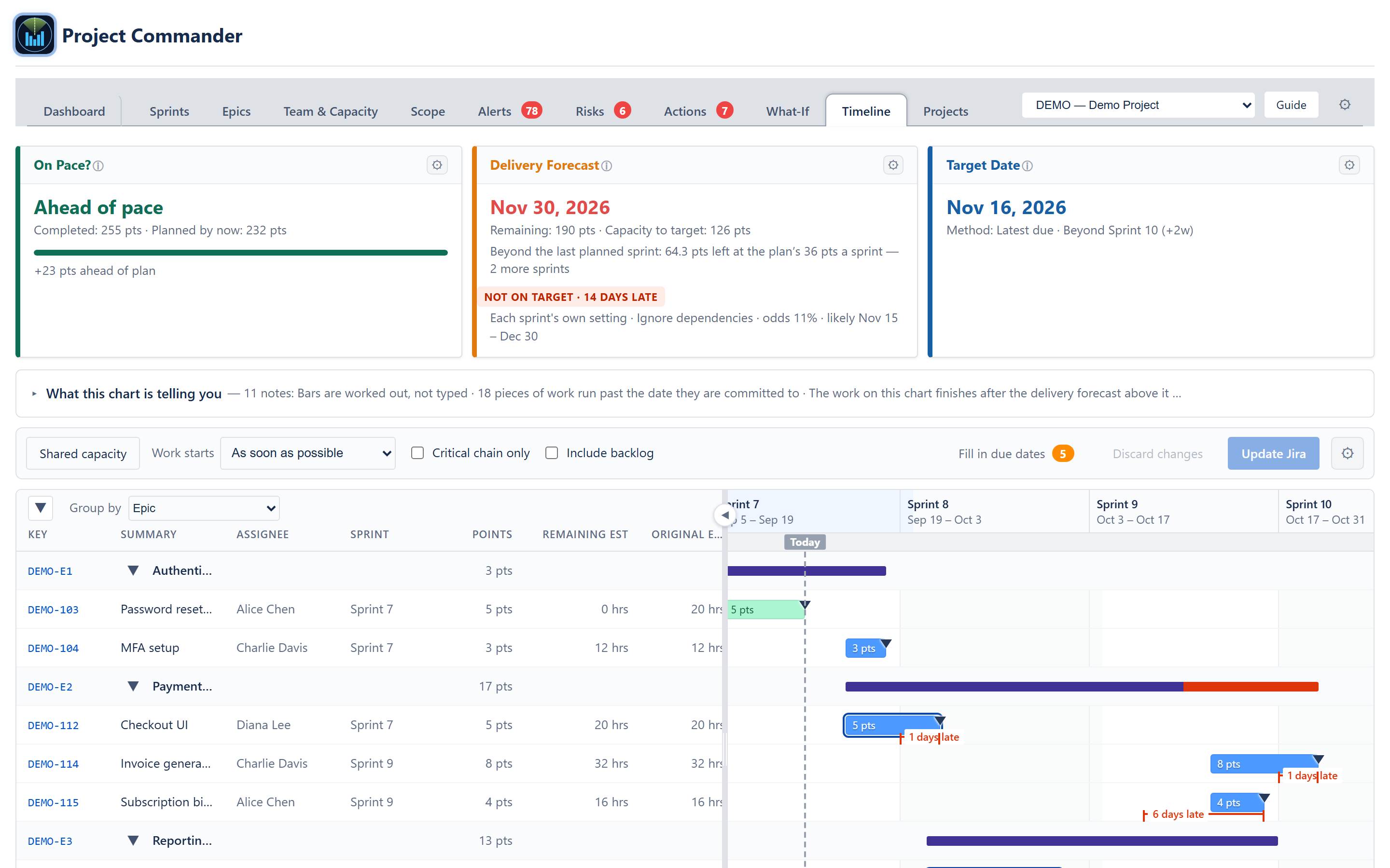
The Timeline tab draws every epic and issue as a bar on a calendar, for one project or for every registered project at once.
The bars are not typed and they are not dragged into place by a planner. Each bar sits where Project Commander's own scheduler says the work lands — worked out from the size of the job, who it is assigned to, the hours that person really has, the share of their time they give to work, their booked time off, the public holidays on their calendar, and what blocks what. Change an estimate, a person, a date or a dependency and the whole chart redraws itself.
That is the difference from every other Gantt chart in the Jira world. A dragged bar is only as true as the last person who dragged it, and somebody has to keep dragging it for the picture to stay true. A bar here keeps working itself out.
It is intended for project managers, engineering managers and programme leads who need to show a plan as a picture — to a stakeholder, in a steering meeting, or on a screen share — without maintaining a second plan by hand.
The three cards above the chart
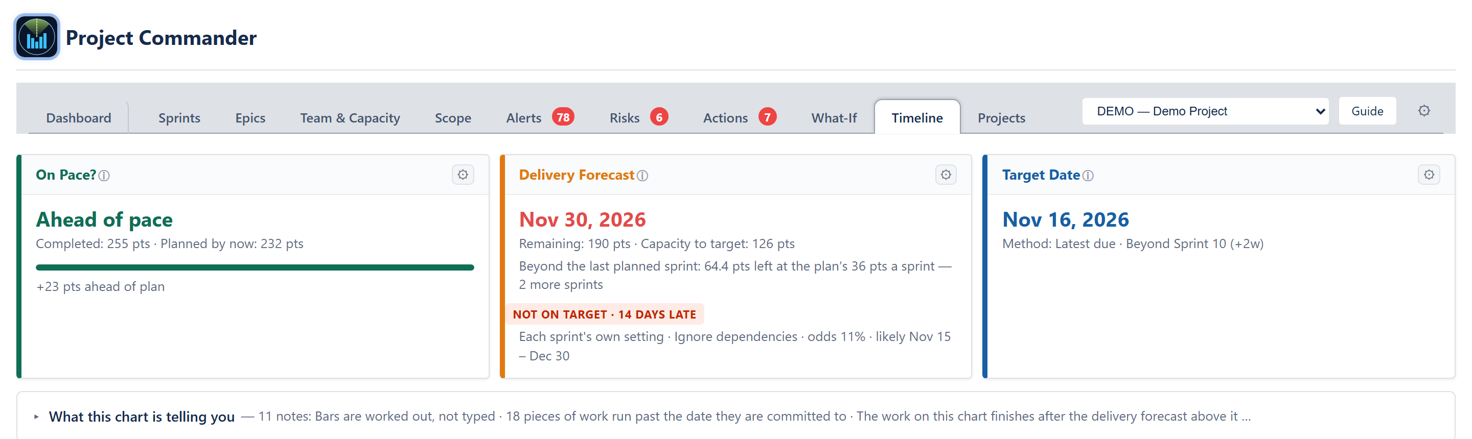
Three cards run across the top of the tab, in this order: On Pace?, Delivery Forecast and Target Date. They are the app's own cards, drawn by the same components the Dashboard and What-If tabs use, reading the same numbers. A figure on this tab and the same figure on another tab can never disagree, because there is only one calculation behind both.
What this chart is telling you
Beneath the cards sits a folding notice headed What this chart is telling you. It starts folded, showing the number of notes and the first few of their headings; opening it gives the full list.
It says in plain words what the picture is showing, so the chart is never the only place a fact appears. Depending on what is on screen it carries:
- That the bars are worked out and not typed, and which Work starts rule is in force. This note is always first.
- For a project with Sprint Mode off: that the project has no sprints, that the columns are its own planning periods, how long each one is, and what is hidden as a result.
- For a mixed selection: that the projects on screen do not all use sprints, so the columns fall back to weeks — the one scale that means the same thing in both.
- How many pieces of work fell back to as soon as possible because they have no epic start date, or no due date, under the rule that is selected.
- Each piece of work blocked by work that comes later, named, with both sprints: "DEMO-34 in Sprint 7 waits on DEMO-41 in Sprint 8".
- Each circular dependency, named as a pair.
- Who is over capacity, and with more than one project on screen, the target date each person fails at and why.
- That the Start Date column is the date held in Jira, that editing it writes that field, and how many pieces of work on screen carry one.
- Work due after the target date that is not counted against it: whose it is, and how many working days of it.
- Everybody's real availability — hours a week, the share of their time, booked time off and public holidays — and each person who is not at full pace between now and the target date, with the reason.
- With more than one project on screen: that there are several projects and one schedule, and who works across more than one of them.
- With Critical chain only ticked: how many pieces of work are on the chain, how many days of work that is, and which of the two things the chain is.
- With no grouping: that the list is earliest due date first, that an issue with no due date of its own is due at the end of the sprint it is in and one in no sprint takes its epic's date, and how many have none of the three.
- With a sort on: which column, which direction, and that it applies inside each band.
- How many bars are placed by a date somebody typed rather than worked out, and how many of those are not yet written to Jira.
The chart
Columns
Columns are the project's sprints, named and dated exactly as the What-If cascade chart names them, with projected sprints past the last planned one marked as projected. In a project with Sprint Mode turned off, the columns are that project's own planning periods, each as long as its Period Length.
Scale and Zoom sit together in the strip along the bottom of the chart, at its right-hand end. Scale chooses sprint, week or month; zoom is a slider with a minus and a plus either side of it, and the percentage beside it. The chart opens scrolled to today.
What is drawn on the calendar
- Today — a dashed vertical line.
- The target date and the forecast date — a purple T pin and a red P pin, the same two markers the What-If cascade chart uses, carrying the same dates as the cards above.
- The likely range — a light shaded band from the optimistic to the pessimistic finish date, which is the "likely" figure on the Delivery Forecast card.
- Past the target — hatched shading from the target date onward.
- Epic spans — a thin dark bar from an epic's first issue start to its last issue finish. Its due date is an arrow on that bar, and the stretch that runs past the due date is drawn in red, so an epic that overruns says so in its own bar.
- Issue bars — from forecast start to forecast finish, with the done share filled in darker from the issue's own progress and finished work in green.
- Work placed by a typed date — drawn striped, so a date somebody chose is never mistaken for one the schedule worked out.
- The committed date — a downward arrowhead on every row at the issue's own due date, the date it is committed to in Jira. Where the bar runs past it, the days late are measured and labelled on the row.
- Over capacity — a bar whose owner is overloaded in the stretch it falls in takes a red ring, keeping its own colour, so overload is visible without turning the chart red.
- Dependency arrows — from Jira's own blocks links. Every line and arrowhead is grey. An arrow that points backwards, from later work to earlier work, is drawn dashed: that is work waiting on work that is scheduled after it, and it is the same conflict the Alerts tab reports.
The table down the left
Twelve columns: Key, Summary, Assignee, Sprint, Points, Remaining Est, Original Est, Status, Type, Start Date, Due Date and Progress. An epic's own row carries its heading and its rolled-up total. The Sprint column is dropped in a project with Sprint Mode off, because there is nothing to put in it.
Every heading sorts. Clicking one sorts by it, clicking again reverses it, and a third click puts the order back to whatever the grouping gives. Sorting happens inside each band, never across bands.
The divider between the table and the chart is draggable. The two panes scroll together: the table follows the chart vertically, and the column headings follow it sideways.
Start Date means the date held in Jira — the same field the rest of the app calls Start Date — and editing that cell writes that field. Where Jira holds no start date, the cell shows the worked-out date instead, marked as worked out.
Grouping and folding
Group by sits in the heading of the table on the left, above the column names, because what it changes is that table's rows. Five choices:
- Epic — one band per epic, its issues beneath.
- Person — one lane per person, carrying their work from every project on screen, with the project named on each bar.
- Project — one band per project. This is the default with more than one project on screen.
- Sprint — one band per sprint. Reads Period in a project with Sprint Mode off.
- No grouping — every piece of work in one flat list, earliest due date first, an issue with no due date of its own being due at the end of the sprint it is in, one in no sprint taking its epic's date, and work with none of the three sitting at the end.
Beside it is one arrow that folds every band or opens them all again. It points down when anything is open and right when everything is shut.
Where the work starts
The chart needs to know the earliest a piece of work can begin. Most teams do not put start dates on issues, so Work starts in the control row offers three rules:
- As soon as possible — the default. Work begins today, pushed later by whatever blocks it and by whatever else is already queued for the person doing it.
- Not before the epic starts — an issue cannot begin before the start date on its epic. An epic with no start date, or one that has already passed, changes nothing.
- Just in time for the due date — offered in time projects only. The bar is placed so the work finishes on the issue's due date, starting back by as many working days as its hours need.
Whichever is chosen, the notice above the chart says which rule is in force, so when a date moves it is clear what moved it.
One thing is never a choice: a person's booked time off and the public holidays on their calendar push their work later under every rule. Whether somebody is at work is not a preference. A whole day booked off steps the work over that day, so a week of leave moves the finish a week later; half a day booked off does not shorten a bar, because the day is still a day at work, and its hours are still subtracted everywhere capacity is worked out.
The critical chain
Critical chain only, a box in the control row, fades every bar that is not on the chain, along with every epic span, committed-date marker, days-late measurement and dependency arrow that belongs to faded work. There is no separate view to switch to — it is the same chart with everything else turned down.
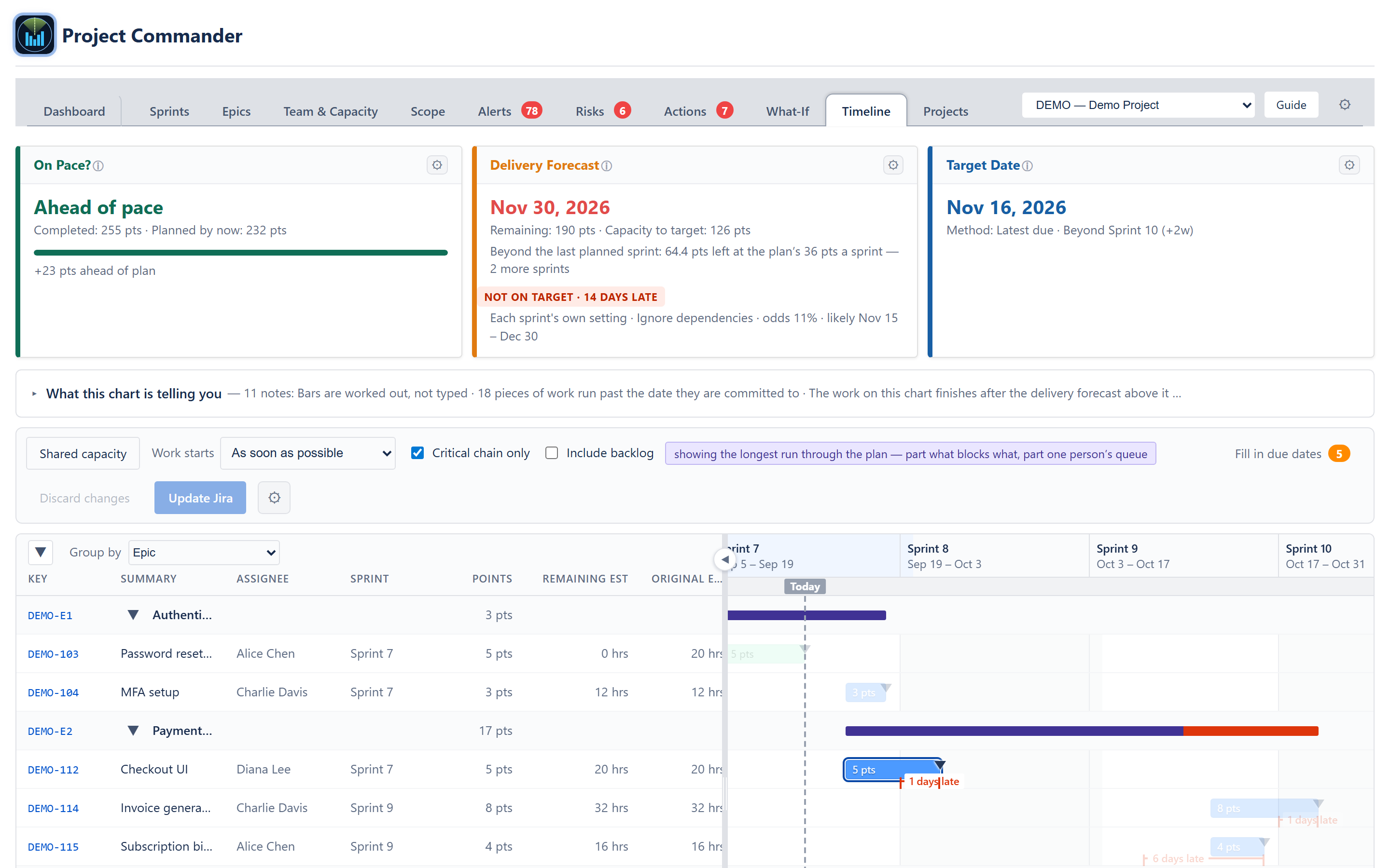
The chain is the longest run through the plan, and two different things can hold a run together: work blocked by work, and one person doing several jobs one after another. The tab says which it is — beside the box while the box is ticked, and in the notice above the chart. A run held together by blockers is shortened by breaking a dependency; a run that is one person's own queue is shortened by finding a second pair of hands, and the note names that person.
More than one project at once
The project selector is the app's own, at the right-hand end of the tab bar: Program view, then every registered project by key and name.
The part that matters is underneath the picture: the schedule is worked out once across every project on screen, never per project and then stacked. A person has one capacity and one queue, not one per project. That is the difference from the portfolio views in the other tools, which stack one chart per project — so a person booked solid on two projects looks comfortable on both.
- Group by Project is the default with more than one project on screen.
- Group by Person gives one lane per person carrying their work from every project, with the project named on each bar. This is where a person loaded across two projects becomes visible.
- The three cards read the same roll-up across projects the What-If tab's All Projects view uses, so they cannot disagree with it.
- Every project keeps its own target date, and no project is judged against another project's date. The shading that marks time past the target begins at the last of the targets on screen.
Shared capacity is a button beside the grouping, not a sixth grouping choice. One press sets two controls at once — the project selector to Program view and Group by to Person — and pressing it again puts both back.
Hovering and clicking
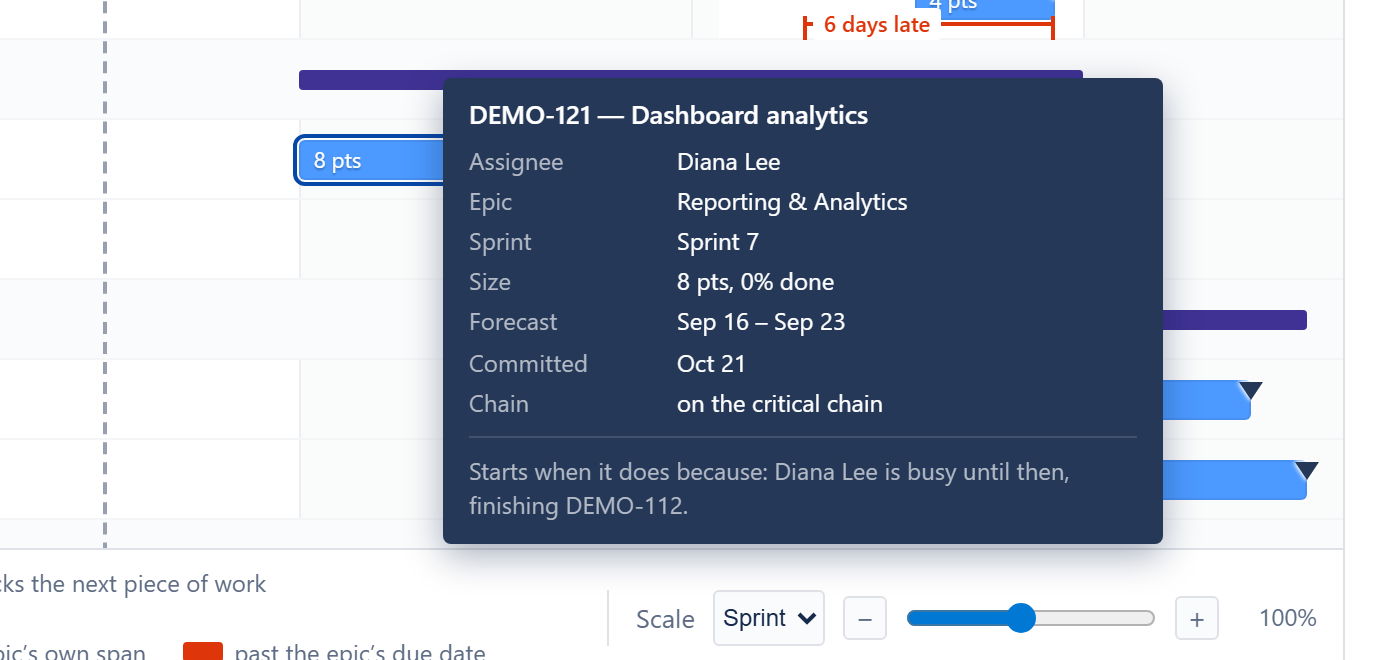
Hovering a bar shows a card carrying the issue key and summary, its project, its assignee, its epic, its sprint, its size with the share done, the pace it was drawn at (the hours a week whoever holds it is down for, and what that is a day), its forecast start and finish, its committed date with the working days late where it runs past it, what it blocks, whether it is on the critical chain — yes or no, either way — and — in a sentence — why it starts when it does: today, a date set by hand, its epic starts then, it is timed to finish on its due date, it is waiting on a blocker, or the person who has it is busy until then. Where the date was typed rather than worked out the card says so, and says that double-clicking the bar clears it.
Clicking an issue key — in the table, or on an epic's own row — opens that issue in Jira in a new tab, as the key on the Epics tab does. The bars themselves are for dragging, so clicking one does not open anything.
Editing on the chart
Bars can be dragged and resized, and cells in the table can be changed. Nothing is written to Jira as it is dragged.
- Drag a bar sideways — sets the issue's start date, and its due date moves with it so the length is unchanged.
- Drag either end — makes the bar longer or shorter, which changes the size of the work rather than its due date. The length of a bar is the work, so the estimate follows it.
- Drag a bar into another person's lane — reassigns the issue to that person. Available when the chart is grouped by Person.
- Drag a bar onto another sprint band — moves the issue to that sprint. Available when the chart is grouped by Sprint, in a project that uses sprints.
- Change a value in the table — Assignee, Points, Sprint, Start Date and Due Date can be edited in place. Status is shown but not edited here: changing a status is a transition in Jira rather than a field, and this tab does not make one.
A changed cell or bar is marked as changed, the chart is worked out again from the change straight away, and the count of waiting changes appears on the Update Jira button. Discard changes puts everything back.
Nothing reaches Jira until Update Jira is pressed. The confirmation lists every change, issue by issue and field by field, under a line saying that nothing has been written yet, with Cancel beside it. A change Jira refuses stays on the chart and is reported as refused, with Jira's own reason, rather than being reported as saved.
Fill in due dates (added 2026-09-10) stages a due date for every piece of work on the chart that has none of its own in Jira, using the date the chart is already using for it — the end of the sprint it is in, or its epic's date when it is in no sprint. Most teams put a date on an epic and nothing on the work inside it, so every screen borrows that date while Jira itself still holds nothing, and the board, the backlog and every other tool show no date at all. The button's count is how many pieces of work it would give a date to; work that already carries a date somebody typed is never touched, and neither is work that has just been given one on this chart. Nothing is written when the button is pressed: the dates join the waiting changes and go through Update Jira like every other change, so the list is seen first. After they are written, the report offers Undo N due dates, which puts each of those dates back to nothing — through the same list-then-write path, so nothing is undone unseen either.
A bar stays where it is dropped. A date set by hand anchors the work to it, so nothing afterwards moves it — not a blocker, not the queue of the person doing it — and the bar is drawn striped from then on to say so.
Editing works in the app inside Jira. The connected web app is forced read-only, so there the chart draws, the bars do not move, and the Update Jira button is not shown.
What the first version deliberately does not do
- No dragging as a what-if. A bar that is moved sets a date, and that date is written to Jira on the button. To test a change without writing anything, use the What-If tab.
- No writing without the button. Nothing on this tab reaches Jira until Update Jira is pressed and the list of changes is confirmed.
- No new numbers. Every date, share, verdict and label on the tab is one the app already shows elsewhere.
Where the numbers come from
The bars come from the same scheduler that draws the Critical Chain section on the Projects tab: it forward-schedules every open issue from today, respecting dependencies, each person's real capacity, and any date already set on an issue.
The target date, the forecast date and the likely range come from the Delivery Forecast card above the chart, unchanged.
Those two are different calculations answering different questions, and where they disagree the chart says so rather than hiding it: the last bar on the chain carries on to the forecast pin as a lighter, hatched tail, labelled with what it is. Hovering the tail says it in a sentence — the chain of work finishes on one date, and the forecast allows further time for how much the team's velocity has varied.